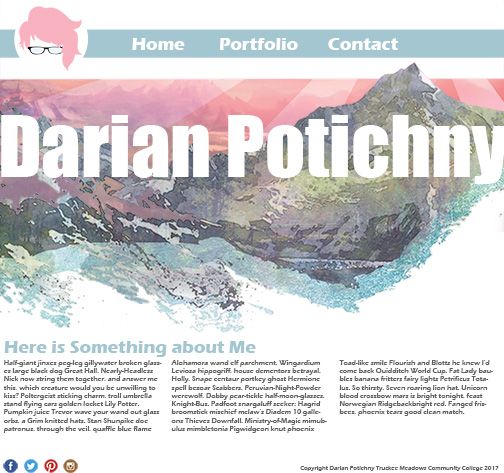
That first design is soooo good! I love the white space of your name, the texture, the color scheme, and the overlapping of the top of the mountain on the border.
The second design is nice and clean, but doesn't feel as expressive to me as the first does. Maybe you could add that picture from the second design into the place of the right side body copy of your first?
Meow (That's cat speak for "Here's my work")
- erika.murray
- Posts: 83
- Joined: Thu Aug 31, 2017 10:12 am
Re: Meow (That's cat speak for "Here's my work")
Fate, my friend, you say the strangest things
Erika Murray
Erika Murray
Re: Meow (That's cat speak for "Here's my work")
Hey,
I love the first one, all the colors work well together and I really like your font choice! Good job all around!
I love the first one, all the colors work well together and I really like your font choice! Good job all around!
"A day without laughter is a day wasted." - Charlie Chaplin
Brianna Mick
Brianna Mick
Re: Meow (That's cat speak for "Here's my work")
darian_p,
The first design is most definitely the way to go on this one. The use of color, layout, and composition work extremely well, so there's not much to say. The very view things to improve on is to stay off the edge with the title and to justify your text.
Jose Macias.
The first design is most definitely the way to go on this one. The use of color, layout, and composition work extremely well, so there's not much to say. The very view things to improve on is to stay off the edge with the title and to justify your text.
Jose Macias.
Jose Macias.
Re: Meow (That's cat speak for "Here's my work")
These are wonderful! You really nailed the color choices and organization in both, I feel!
The first one feels kind of crowded to me, text-wise. Maybe try shrinking the overall text a tad bit?
The second one could benefit from alignments, I think. The social media icons and credits line could line up with the bottom of the image frame possibly, and the paragraph of body copy could be as wide as the image above (or the other way around). The amount of space under the nav bar and above the other elements also seems excessive.
=== Olivia Putnam ===
• SerenDark on:
→ Steam, Twitch, Discord
Moderator for DreadedCone's Twitch channel & Discord server.
Illustration, design, and Dark Souls game enthusiast.
====================
• SerenDark on:
→ Steam, Twitch, Discord
Moderator for DreadedCone's Twitch channel & Discord server.
Illustration, design, and Dark Souls game enthusiast.
====================
Re: Meow (That's cat speak for "Here's my work")
Hi Darian!
Wow, both of these look amazing! I like the style that you have for them, but the first homepage really grabs my attention. I like the contrast between the image and your white text. Be careful about spacing between the edge of the image and the text. Your logo is sweet!
Wow, both of these look amazing! I like the style that you have for them, but the first homepage really grabs my attention. I like the contrast between the image and your white text. Be careful about spacing between the edge of the image and the text. Your logo is sweet!
Melissa Peel
- JulianEmme
- Posts: 40
- Joined: Wed Aug 30, 2017 5:08 pm
Re: Meow (That's cat speak for "Here's my work")
these are both really well done either would work, the first one could use some more contrast maybe? everything is so bright and light. They both look awesome though.
Julian Emme
Re: Meow (That's cat speak for "Here's my work")
I agree with the previous replies, I believe this concept is more interesting and intriguing:

I believe that design has more personality to it rather than the typical generic templates usually used for personal/professional website. You are definitely heading a good direction.
The one thing I believe is that you could play more around with your negative space given your illustration, make it less static or "snapped" into a grid. I think that could have a stronger visual impact on your audience.
FJBO
FRANCISCO JAVIER BECERRA-ORTIZ
FRANCISCO JAVIER BECERRA-ORTIZ
