
Hi everyone!
Thank you so much for your inputs, and your help, I had decided and selected the second one for my project 1 Final.
Since I kept in mind everyone's suggestions, I gathered some good ideas for this project design.
What I have changed is:
First to select one family type (America typewriter) for my whole final project design, instead of having two type families.
Second, I played with paragraph setting to make it readable and more appealing to the readers,
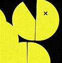
Third I replaced the green TMCC logo for the black TMCC logo,
I also had remove my self-portrait from home page Since honestly, I do not think it was relevant to my project's design,
then I reorganized and added a light-gray color bar as background to the navigation bar,
last, I added three new pages to my final design, which are; Projects, Resources, and Contact page.
I am very excited, how this project has been turning out, I hope you like them. Let me know what you think.
Project 1 Final
-
Marco_Horta1

- Posts: 64
- Joined: Wed Aug 30, 2017 5:11 pm
Project 1 Final
- Attachments
-
- project_1_home_page
-
- project_1_projects_page
-
- project_1_resources_page
-
- project_1_contact_page
"Whoever is trying to bring you down, is already below you"- KUSHANDWIZDOM
Marco Horta
Marco Horta
-
Ariesboxsye

- Posts: 76
- Joined: Wed Aug 30, 2017 5:10 pm
Re: Project 1 Final
Seems you have an idea over all of where you what this website to go. I like how organized this set of layouts become, still a bit off on the GRC logo on the top corner, but it feels like it works.
~Names Aries Shelley~
-
Kyler_Rose
- Posts: 97
- Joined: Wed Aug 30, 2017 5:11 pm
Re: Project 1 Final
Good job one your websites and going the next step and making multiples webpages. Over all everything is extremely orizaged, but you did forget one of the requirements of having a picture of yourself some where in the website.
Kyler Rose

-
selvster5000
- Posts: 84
- Joined: Wed Aug 30, 2017 5:09 pm
Re: Project 1 Final
Hey Marco!
Love the way your website is coming along! The changes you made were perfect.
I really like the justified type, makes your design look super clean. I'm also
fond of your logo, it's super expressive and resembles the GRC program. I
might try to center the logo in the header column though. It appears to me that
it maybe to low?
Great work!
Cheers,
Hannah Selvey
Hannah Selvey
Re: Project 1 Final
Great work! Nice and clean design. I like the GRC 175 logo. Very creative. On your contact page, I like the silhouette of the man in the suit. Has a Mad Men- retro vibe going which is really cool.
Susie Lang
-
erika.murray

- Posts: 83
- Joined: Thu Aug 31, 2017 10:12 am
Re: Project 1 Final
I love these designs! The imagery is nice and your layouts and easy to read and easy to follow. I think that for how clean these layouts are, the GRC logo still does not reflect your website. It either needs to be smaller, or you could simplify it and create a new one (although that might be more work). Awesome job!
Fate, my friend, you say the strangest things
Erika Murray
Erika Murray
Re: Project 1 Final
Love your use of diagonals to make the bodycopy more interesting! The graffiti is great too.
I would suggest keeping the TMCC logo in the same spot on each page, so that the viewer knows where to expect it.
I would suggest keeping the TMCC logo in the same spot on each page, so that the viewer knows where to expect it.

-
Instructor

- Site Admin
- Posts: 1909
- Joined: Thu Jul 21, 2011 8:51 am
Re: Project 1 Final
Wow! Not just a homepage, but an entire site. You've gone above and beyond here, Marco.
Removing the drop shadow really cleaned it up. I like the way your logo breaks the edge of your top bar to add depth. Your 3D text texture looks good as always and adds a bit of visual interest to a clean design. The use of one font throughout was a strong choice as well. You're just using weight and size to establish hierarchy. The typewriter look is an interesting one and gives the website a bit of an old timey feel that you've embraced on your inner pages. Good use of margin throughout the composition.
I think your bodycopy could use a bit more leading. Right now the lines look a little tight.
Nicely done.
"Inspiration is for amateurs. The rest of us just show up and get to work." — Chuck Close
Michael Ganschow-Green - GRC 175 Instructor
mganschow@tmcc.edu | 673-8200 ext.5-2173
Michael Ganschow-Green - GRC 175 Instructor
mganschow@tmcc.edu | 673-8200 ext.5-2173
Re: Project 1 Final
Hello Marco!
The design is looking good! The more simple, streamlined homepage is stronger. Your name could be more prominent on the page. The designs to the other pages are looking good too. Each page is solidly unified by the nav bar and header, offset by the colorful, creative logo.
The design is looking good! The more simple, streamlined homepage is stronger. Your name could be more prominent on the page.
Melissa Peel