
project one
Re: project one
JulianEmme,This works really well visually speaking and good font choice. The things to change wood be to use the complete dmcc logo and to place your email at the bottom center of your design.
Jose Macias.
Re: project one
I like the deign its very engaging, I would like to see the body copy moved up closer to your title and I would bring your email down to the bottom, it seems a little out of place at the top.
"A day without laughter is a day wasted." - Charlie Chaplin
Brianna Mick
Brianna Mick
-
Pearl_Underwood
- Posts: 63
- Joined: Wed Aug 30, 2017 5:29 pm
-
chaytothet
- Posts: 91
- Joined: Wed Aug 30, 2017 5:08 pm
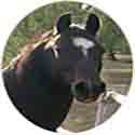
Re: project one
Lookin' good! 
I love the layout, the signature idea is very unique and I like it!
I'm not so sure about the image though, it does have the artistic touch, but it also looks like it was taken on an old flip phone, I have confidence that you could get a better picture or possibly as was mentioned in another post use image trace so you have the crisp lines that will show up on bigger monitors.
-Chalyn
Just because my path is different doesn't mean I'm lost
-Gerard Abrams
Just because my path is different doesn't mean I'm lost
-Gerard Abrams