
Sorry It took me so long to get these up here.. been a busy week.
Here are my two roughs.
My inspiration web sites are:
http://www.captaindash.com
http://www.Interiors.davroc.co.uk
Thanks,
Matt
Here are my Roughs for review.
Here are my Roughs for review.
- Attachments
-
- The panel with the projects would be images that rollover to reveal "project one" etc.
-
- On this one I'm thinking of having the shadow as the rollover effect. I'm not sure I like the Idea of the logo as the image on the right, so I might replace that.
-
Instructor

- Site Admin
- Posts: 1909
- Joined: Thu Jul 21, 2011 8:51 am
Re: Here are my Roughs for review.
Neat!
Thanks for the update.
I'll wait a day or so to give my 2¢, so your classmates can post theirs'.
Thanks for the update.
I'll wait a day or so to give my 2¢, so your classmates can post theirs'.
"Inspiration is for amateurs. The rest of us just show up and get to work." — Chuck Close
Michael Ganschow-Green - GRC 175 Instructor
mganschow@tmcc.edu | 673-8200 ext.5-2173
Michael Ganschow-Green - GRC 175 Instructor
mganschow@tmcc.edu | 673-8200 ext.5-2173
Re: Here are my Roughs for review.
I like both of these, but the first one with the black background is the one I like more. The only thing I would suggest would be something to separate your name at the top from the gray band it's sitting on. I think your name gets kind of lost because it blends into the band. Maybe a thin black line or make one of them a different shade of gray . . .?
Good job, and thanks for your input on my page. I was thinking the same thing about the buttons words.
Denise
Good job, and thanks for your input on my page. I was thinking the same thing about the buttons words.
Denise

Re: Here are my Roughs for review.
I am leaning more toward your second design. It has great color choices and its layout is good. I would however loose the shadow effect on the button elements. That or lower the opacity of the shadow so the emphasis is on the text rather than the shadow.

-
mike_check

- Posts: 23
- Joined: Mon Jan 23, 2012 7:03 pm
Re: Here are my Roughs for review.
I like the colors of both of them, but I also am leaning towards your second layout. The flow of the angles seem a bit more interesting. The shadows of the link text do feel a little heavy.
MIKE_CHECK
two.three.whatisthis
BLCITY.TasteMakers coming soon
two.three.whatisthis
BLCITY.TasteMakers coming soon

Re: Here are my Roughs for review.
I like the first layout, I can see why some people like your second layout, possibly because it is unique...but its angles and shadows and placement of design elements don't seem to quite mesh right and for me its causing a little balance issue and contrast when I look at it, its almost as if the elements are conflicting with each other as they are right now...maybe that's the effect you were going for, I'm not sure, but IF you choose this layout then you have to really push it and push it far enough in the angles and layout that it blends better...hope that made sense!?!?
However, your first layout is good! I like your use of bold image on the right hand side, and how you are playing with the negative space...I think this one could really go far if you continue to work it out. Maybe try playing with the size of the buttons, they over power your cool image on the right...try making the image more prominent and the buttons not so much. Right now all of your design content is about the same size so any hierarchy of info or design is sort of lost. Try picking ONE element to push out and take everything else a few steps back and I think it will make a difference in overall flow of the content within the space. Give the eye a place to go first and then move it around the layout...Hope all this helped, your colors are great, love the "pop" they give off the page and I like how you are pushing the Typography on both the layouts, very nice to see once in a while!
However, your first layout is good! I like your use of bold image on the right hand side, and how you are playing with the negative space...I think this one could really go far if you continue to work it out. Maybe try playing with the size of the buttons, they over power your cool image on the right...try making the image more prominent and the buttons not so much. Right now all of your design content is about the same size so any hierarchy of info or design is sort of lost. Try picking ONE element to push out and take everything else a few steps back and I think it will make a difference in overall flow of the content within the space. Give the eye a place to go first and then move it around the layout...Hope all this helped, your colors are great, love the "pop" they give off the page and I like how you are pushing the Typography on both the layouts, very nice to see once in a while!
"Design is simply thinking made visual"
-
artgalstyle
- Posts: 121
- Joined: Mon Jan 23, 2012 8:19 pm
Re: Here are my Roughs for review.
I also like both your designs but think the first is stronger. I also feel you need a little space so that your name stands out from the button. I would love the see the buttons not as large or just using your font or you see it when you roll over it. I also love the image on the right and agree it could stand out more. I do love the space of your second design and the logo/letters are way cool. Hope this helps.
Laramie
Laramie

Re: Here are my Roughs for review.
Loving both.
On the first, I would lose the big buttons and small buttons, lose the blue panel behind the big buttons. It's a big open space and you're wanting to fill it. BUT, maybe go with some representative typography for the links. Play with another lesser, image to the bottom left to balance the awesome image on the right. The project 1 specs call for an introductory paragraph, but I am not certain Michael is holding us to that. If so, that can help fill your content area.
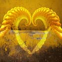
On the 2nd rough. It is beautiful. Love the big logo and it's shadow leading into the middle.
I agree the shadows of the links would work better if they were less opaque or even cooler, their opaqueness was a gradient, making the letters disappear as they extended from their bases.
I don't like that the underline of the last link connects with the logo image. I would vote in favor of shortening that line.
Great, inspiring designs! Looks very current and HIP!!!
On the first, I would lose the big buttons and small buttons, lose the blue panel behind the big buttons. It's a big open space and you're wanting to fill it. BUT, maybe go with some representative typography for the links. Play with another lesser, image to the bottom left to balance the awesome image on the right. The project 1 specs call for an introductory paragraph, but I am not certain Michael is holding us to that. If so, that can help fill your content area.
On the 2nd rough. It is beautiful. Love the big logo and it's shadow leading into the middle.
I agree the shadows of the links would work better if they were less opaque or even cooler, their opaqueness was a gradient, making the letters disappear as they extended from their bases.
I don't like that the underline of the last link connects with the logo image. I would vote in favor of shortening that line.
Great, inspiring designs! Looks very current and HIP!!!
Re: Here are my Roughs for review.
...forgot one thing. On the first rough, the green GRC175 detracts from your super-cool site. Maybe smaller? Maybe a footnote-type element?
The eye is drawn to the brightest spot and the largest spots. Right now, that's it.
The eye is drawn to the brightest spot and the largest spots. Right now, that's it.
Re: Here are my Roughs for review.
Well done Matt. I like your first rough design. Your blending of name into border works for me - it's still readable. Though I'm not to certain about the font in white. It's a good layout but everything seems to be sized the same. Nothing stands out. Possibly the image at right with GRC175 could be the dominant and add or adjust the black negative space.
The second rough is interesting and original but for me the angles and shadows distract a bit.
Thank you for sharing your layouts. ~ Pat
The second rough is interesting and original but for me the angles and shadows distract a bit.
Thank you for sharing your layouts. ~ Pat