
Wow these are super cool! I love how fluid both of your designs feel. Personally, I love the first one. I feel that your colors work really well together. I absolutely love how the pieces of your design changes with the mobile and the web version, that's really awesome. The stroke width changes within your lines also is a great touch. Something I suggest doing is increasing the stroke of your text to either .25 - .5 because it's a little hard to read right now. I also feel like a bolder font for your name would look really nice with the thinner fonts you have, but either way still looks great. Awesome job!
Preliminary Critique!
-
ItsAllisxn

- Posts: 137
- Joined: Tue Jan 26, 2021 7:46 pm
Re: Preliminary Critique!
Hi Lindsey!!
Wow these are super cool! I love how fluid both of your designs feel. Personally, I love the first one. I feel that your colors work really well together. I absolutely love how the pieces of your design changes with the mobile and the web version, that's really awesome. The stroke width changes within your lines also is a great touch. Something I suggest doing is increasing the stroke of your text to either .25 - .5 because it's a little hard to read right now. I also feel like a bolder font for your name would look really nice with the thinner fonts you have, but either way still looks great. Awesome job!
Wow these are super cool! I love how fluid both of your designs feel. Personally, I love the first one. I feel that your colors work really well together. I absolutely love how the pieces of your design changes with the mobile and the web version, that's really awesome. The stroke width changes within your lines also is a great touch. Something I suggest doing is increasing the stroke of your text to either .25 - .5 because it's a little hard to read right now. I also feel like a bolder font for your name would look really nice with the thinner fonts you have, but either way still looks great. Awesome job!
Allison Hartmann - Kachow 
-
it's_crysta

- Posts: 117
- Joined: Tue Jan 26, 2021 8:48 pm
Re: Preliminary Critique!
Hi Lindsey,
I like your second design over the first one, I think if you just fixed some contrast issue you have it'd be perfect. The blue and yellow you have now are kind of hard to look at but if you took the yellow that you have in the type box and tried a darker blue it would help fix those problems. Great work!
I like your second design over the first one, I think if you just fixed some contrast issue you have it'd be perfect. The blue and yellow you have now are kind of hard to look at but if you took the yellow that you have in the type box and tried a darker blue it would help fix those problems. Great work!
it's Crysta (Clark)
i feel like i'm on neopets again
i feel like i'm on neopets again

Re: Preliminary Critique!
Wow these roughs are awesome I really like the black and red one the most because my eyes felt more comfortable with that one and I like the elements you added
I'm trying my best ┐(´∀`)┌ .......
Estrella
Estrella
-
kmohara5190
- Posts: 141
- Joined: Tue Jan 26, 2021 7:32 pm
Re: Preliminary Critique!
Hi Lin,
Your style comes through in your designs, which makes them fun to look at! I think I prefer your first website design because of strong color scheme that makes the graphics and text stand out more. Maybe moving the text closer in from the edges in this design would help its proximity, and make the elements appear more related to one another. Nice job!
Your style comes through in your designs, which makes them fun to look at! I think I prefer your first website design because of strong color scheme that makes the graphics and text stand out more. Maybe moving the text closer in from the edges in this design would help its proximity, and make the elements appear more related to one another. Nice job!
Kierann O'Hara
-
Instructor

- Site Admin
- Posts: 1869
- Joined: Thu Jul 21, 2011 8:51 am
Re: Preliminary Critique!
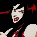
Oh that red, white, and black one is really nice, Lindsey.
Great use of contrast on this one. The red, white, and black are working well together. I like the two flavors of moth drawing for the different resolutions and how one moth is basically an inversion of the other. Also, that heart on the moth is a nice little detail. I like the topographical map background too. It makes for a great soft blob texture that adds a lot of visual interest. Your layout itself is very clean and easy to navigate. I can move through it and find what I need easily. Great use of margins as well. Nothing feels overcrowded nor is the design fragmented.
I'd recommend bolding the bodycopy and navigation up just a little (maybe to a Book or Regular font from a Light) like the weight you use on your class info at the bottom. I'm losing the navigation and bodycopy in the black background a bit.
Nicely done!
"Inspiration is for amateurs. The rest of us just show up and get to work." — Chuck Close
Michael Ganschow-Green - GRC 175 Instructor
mganschow@tmcc.edu | 673-8200 ext.5-2173
Michael Ganschow-Green - GRC 175 Instructor
mganschow@tmcc.edu | 673-8200 ext.5-2173
-
Mal-Festio
- Posts: 142
- Joined: Tue Jan 26, 2021 8:26 pm
Re: Preliminary Critique!
Hey Lindsey,
You did an incredible job making the shapes and illustrations for both of your designs. It is tough to choose which one I like the most between them; the color schemes are making it very difficult to choose. I know that you will print the butterfly design on a t-shirt, so I think that is my deciding factor for choosing the first one. I think doing it for both projects will match make it a brand for yourself. The grey you chose for some of your text is a bit too close to the black background, which is making it a bit loss to the black.. Maybe use a bit of shades lighter so it can stand out a bit more.
You did an incredible job making the shapes and illustrations for both of your designs. It is tough to choose which one I like the most between them; the color schemes are making it very difficult to choose. I know that you will print the butterfly design on a t-shirt, so I think that is my deciding factor for choosing the first one. I think doing it for both projects will match make it a brand for yourself. The grey you chose for some of your text is a bit too close to the black background, which is making it a bit loss to the black.. Maybe use a bit of shades lighter so it can stand out a bit more.
Jordi Cruz Trujillo
Re: Preliminary Critique!
Hi Lindsey 
Your designs are amazing! I really love the use of the designs and color palettes especially the red black and white one but the type needs to be a bit bolder it gets lost with the black because it's too thin.
Your designs are amazing! I really love the use of the designs and color palettes especially the red black and white one but the type needs to be a bit bolder it gets lost with the black because it's too thin.
\₍ᐢ•ﻌ•ᐢ₎*・゚。 Olivia Reyes ( ^..^)ノ
Re: Preliminary Critique!
Hello Lin!
I love all the movement in both of your designs, but it’s also really simple. I’m leaning towards the first design as the colors work really well together. The second set is fun too, but I think I just personally love the combination of red, black, and white and I think you utilized these colors really well. The only change I would make would be to change the font weight of your name, or make it the same font as your links just to help everything feel cohesive.
Good work!
Rowena Piñero
"My vibe is like, hey you could probably pour soup in my lap and I'll apologize to you."
"My vibe is like, hey you could probably pour soup in my lap and I'll apologize to you."