
Hello Everybody!
Here are my final layouts for project one, I bet it's not what anyone expected╮( ̄ω ̄;)╭
Long story short instead of choosing one design and perfecting it I combined my favorite parts of my two first layouts to create my vision. I knew wanted a colorful retro/Memphis design with minimalist aspects that is why I left the background a plain white and added few colorful shapes to make the page pop. I made the layout more uniform even adding a search bar and plenty of space just in case I decide to put other columns on the page. I think I will add some more shapes to the mobile design since its kinda lacking.
I'm happy with the way it turned out☆*:.。.o(≧▽≦)o.。.:*☆
Here are some of the web links that inspired me ⊂(・ω・*⊂)
https://medium.com/makers-byte/the-25-b ... eb1c8734df
http://www.megangtalley.com/
https://pebblepad.com/spa/#/public/mZfr ... tq5MwRgmWy
https://bashooka.com/inspiration/exampl ... -websites/
Project 01 final
-
Instructor

- Site Admin
- Posts: 1869
- Joined: Thu Jul 21, 2011 8:51 am
Re: Project 01 final
It's an 80's party! As a child of the 80's I approve!
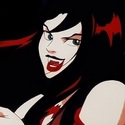
I love that zany background. I'm hearing a synth beat just looking at it. Maybe some Eurythmics. It's just textbook Memphis with maybe a hint of New Wave. Your use of shapes as texture really helps fill in the blank spots in your layout. That icon though. That icon is F R I G H T E N I N G. It can see through me and judge my sins. When I close my eyes tonight, I will see it staring at me from behind my eyelids. Great color choices as well. Very Memphis without being too jarring, which could sometimes happen with those colors. All the shapes feel a little like confetti to me. Avant Garde is a perfect font for your layout. It works extremely well with your aesthetic. The pale background and black type makes for great contrast and easy legibility. Your navigation is easy to see and use. I especially like what you've done with your navigation on your mobile version. That stair step is an interesting look. Very visually striking.
I think I'd probably still prefer left align your bodycopy. The center alignment reads a little fragmented. On your computer layout, the dot grid is a little close to your type. I think it would have looked a little better moved to the right. Your class information is mashed a little close to the bottom on both your computer and mobile layouts.
Nicely done, Olive. This one brings a smile to my face.
"Inspiration is for amateurs. The rest of us just show up and get to work." — Chuck Close
Michael Ganschow-Green - GRC 175 Instructor
mganschow@tmcc.edu | 673-8200 ext.5-2173
Michael Ganschow-Green - GRC 175 Instructor
mganschow@tmcc.edu | 673-8200 ext.5-2173
Re: Project 01 final
Hi Olivia!
I LOVE what you did with the combination. This one took the best parts of both the others and made an even stronger version. I really like that it breathes well and I love the color scheme. All the shapes and forms keep it visually interesting without getting too busy
I LOVE what you did with the combination. This one took the best parts of both the others and made an even stronger version. I really like that it breathes well and I love the color scheme. All the shapes and forms keep it visually interesting without getting too busy
Kiana Bohm

Re: Project 01 final
Hi Olivia,
I love your layout. It is very fun and also super cute. It is minimalist but also filled out nicely in the computer design. I love all the shapes used. The mobile version does not seem as well layed out as the computer one. I would play around with that a little more. Maybe line up the bio part to the left? Just an idea. Really nice job.
I love your layout. It is very fun and also super cute. It is minimalist but also filled out nicely in the computer design. I love all the shapes used. The mobile version does not seem as well layed out as the computer one. I would play around with that a little more. Maybe line up the bio part to the left? Just an idea. Really nice job.

Re: Project 01 final
Hello Olivia,
This design looks really good! I really like the colors, shapes, and navigation bar. This flows very nicely. I think the "about me" and your name could be in a different font, just to make it a bit bolder, so it will stand out more. I also think the mobile version could be arranged a bit to look like your computer version. Overall, great job!
This design looks really good! I really like the colors, shapes, and navigation bar. This flows very nicely. I think the "about me" and your name could be in a different font, just to make it a bit bolder, so it will stand out more. I also think the mobile version could be arranged a bit to look like your computer version. Overall, great job!
- Heather Amistani
Ehhh, What's up Doc?
Ehhh, What's up Doc?
-
gavin_clouser
- Posts: 96
- Joined: Sat Feb 06, 2021 10:03 am
Re: Project 01 final
Olivia. I like the geometric elements you added. I wonder how hard that will be to make in dream weaver. looking forward to the final.
gclouser701
Re: Project 01 final
Hi Olivia,
I'm loving the geometric style and colors for this website design! It's well balanced, and the white space gives the eye some room to rest. Love that you combined both of your website designs to make a new one. Great job!
I'm loving the geometric style and colors for this website design! It's well balanced, and the white space gives the eye some room to rest. Love that you combined both of your website designs to make a new one. Great job!
Kassandra Fuentes
-
jacklyn_yamine

- Posts: 144
- Joined: Fri Feb 05, 2021 5:21 pm
Re: Project 01 final
Hi Olive,
I love your use of those crazy random shapes that still work well with each other, as well as their colors. I think the center aligned body copy is working okay for your computer layout but I would consider changing it to left align for the mobile view and then indenting it so that it matches your cascading menu items. On your computer layout I think you could shift all of your body copy to the right a little more, I personally think it is too far to the left, also those dots are a little to close to the copy as it is right now.
Great job!
JacklynYamine
-
ItsAllisxn

- Posts: 137
- Joined: Tue Jan 26, 2021 7:46 pm
Re: Project 01 final
Hi Olive!
This design is so fun and creative! One thing I really admire is the randomness in it, which may sound weird but it's really hard to place things randomly so kudos to you. The colors that you picked work really well together and I'm loving the transparency. My only suggestion is to left-align your name, information, and body text since it's to the left of the screen. Besides that, I really dig it! Great job!
This design is so fun and creative! One thing I really admire is the randomness in it, which may sound weird but it's really hard to place things randomly so kudos to you. The colors that you picked work really well together and I'm loving the transparency. My only suggestion is to left-align your name, information, and body text since it's to the left of the screen. Besides that, I really dig it! Great job!
Allison Hartmann - Kachow 
-
it's_crysta

- Posts: 117
- Joined: Tue Jan 26, 2021 8:48 pm
Re: Project 01 final
I'm really happy you decided to include Memphis in your final version, you were able to add more while still keeping it from being overbearing. It's a really fun design. Great job!
it's Crysta (Clark)
i feel like i'm on neopets again
i feel like i'm on neopets again