https://naomiromero.com/ https://sunnygetready.neocities.org/
These two websites inspired me because they are more portfolio orientated websites than simple homepages, and since showcasing my work is key for the website I figured they were great inspiration!
These are my two roughs, I like my first rough but the second feels more modern.
I'd like suggestions on the typography, layout, and or color choices. Thanks!
Web version of rough 1
lg_project01_rough-01.png (391.42 KiB) Viewed 61 times
Mobile version of rough 1
Web version of rough 2
lg_project01_rough_Artboard 3.png (1.58 MiB) Viewed 61 times
Oh, I like your second one, Lucio. That background photo adds such visual interest.
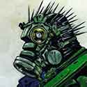
That image is well selected and says a lot about you. It also sets the design and color tone for the document. Because you've faded it back, it allows the other two visually interesting things to pop out against it. The first of those is your coyote-sona. I love his expression. He looks like such a smartass. And you can feel his playfulness because he's breaking out of the visual box the alignments between your bodycopy container and your navigation have created. The second visually interesting bit is your bodycopy container. It's bright white, shining like a full moon over the desert and immediately catches the eye. You balance it nicely with your navigation which is easy to see and presumably to use on your computer version. Nice color selection too. The oranges, the white, and the black all play well with each other and reflect the background image well.
On your mobile version I would enlarge all your buttons and stack them vertically as a series of rectangles that are the same width as your bodycopy container and align to it's edges. You want to make logo buttons large enough for non-precision fat fingertips like mine to use. On your computer version, move your logo and class info up a bit. They're a little tight to the bottom of your bodycopy container. Scoot your title name to the left a little so that it's left edge aligns with the left edge of your bodycopy text.
Good work!
"Inspiration is for amateurs. The rest of us just show up and get to work." — Chuck Close
Michael Ganschow-Green - GRC 175 Instructor mganschow@tmcc.edu | 673-8200 ext.5-2173
Hi Lucio,
I agree with the instructor, your second layout is much more appealing to the eye and your use of color is perfect, I would change that.
The only thing I would suggest is maybe changing the shape of your body copy container to a circle to make it look like the moon to go with the wolf and night sky motif.
Your designs are very clean and easy to navigate. I really like your second design. It has depth, balance, shape, great use of color and is different from many other websites.
Lucio,
I like the colors you used. I like the second design because it has a little bit more interest and I also like the background image.
The only thing I would fix is for the mobile design, it just looks like a shrunken down version of the desktop one. This may be hard for your audience to navigate because the buttons will be very small and close together on a mobile device. Try stacking the buttons on top of each other in the mobile and leaving them as they are on the desktop.
I like your first design the most. I think it is laid out in a simple, yet effective way. I like the colors that you have chosen to use. Using shades of the same color is a really smart idea. I also like your little logo guy above your name! The main thing I would change is adding the background of design 2 to design 1. I think having the mountains in the background of design 1 would really tie the whole thing together. Also, try to play around with different fonts. The fonts you have now aren't bad, I just wonder if there are other fonts out there that could add a bit more personality to your site.
Hi Lucio! I love the color schemes you use! It’s so cool to see the way you keep your own consistent branding in your works! On your second design I love how clean they are but I would utilize more of the space on the screen! I think the use of space is definitely better in your first design but still could use the space more instead of just leaving it for projects!
In regards to typography suggestions, I think you could try using a more cartoon-looking font for your name to match your graphic, and then try to find a font that compliments it for your body paragraph and headers! Layout-wise, I love your second design's layout. The more compact look pulls your eyes In and your graphic frames the box nicely. I do not have any suggestions for color because your color choices already fit so well!