
It is pretty big, but I like it that way. The changes I made to website from critique are because I showed it to some people (Not graphic art students) and they all said they liked it this way. I am sure I will be making changes to it once my knowledge expands in this class.
http://grc175.com/student/fall_2011/cha ... index.html
project_1_charlie_lipon
-
MadBroChadBro
- Posts: 44
- Joined: Mon Aug 29, 2011 7:22 pm
My site
Charlie Lipon
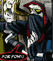
"Why you mad Bro"
"Why you mad Bro"

Re: My site
Your design looks great, good concept of the flowing colors down your site. There is just one problem. Nobody is going to be able to see it. I have 2 monitors that are 1900x1200 and when I spread my page across both of them I could barely see the entire page. I think if your site was half as large or even like a third as large it woul be much better and much more accessable to everyone. I think you just started with a much to large photoshop file and didnt realize what was going to happen. Otherwise I like the idea behind it and its a good site, its just massive.
Kyle Smith
-
MadBroChadBro
- Posts: 44
- Joined: Mon Aug 29, 2011 7:22 pm
project_1_charlie_lipon
It is pretty big, but I like it that way. The changes I made to website from critique are because I showed it to some people (Not graphic art students) and they all said they liked it this way. I am sure I will be making changes to it once my knowledge expands in this class.
http://grc175.com/student/fall_2011/cha ... index.html
http://grc175.com/student/fall_2011/cha ... index.html
Charlie Lipon
"Why you mad Bro"
"Why you mad Bro"

-
brienicole

- Posts: 132
- Joined: Mon Aug 29, 2011 5:02 pm
- Location: Sparks, Nevada
Re: project_1_charlie_lipon
putting the GIANTness aside for now. There are a few other issues you may want to work out. Your body copy on your about me page needs some spaces within your paragraph. What are "some come links"? haha I bet that was also a mistake. and I think it would be cool if you moved your grc text to vertical along one of your paint colors. The thick black line is distracting with the text. But yes I love the pluto and that its YOU!~ this whole site is very charlie and I love that about it. It makes me smile.
~Brianne Porterfield
"What a crazy random happenstance!"
"What a crazy random happenstance!"

Re: project_1_charlie_lipon
Yes, the site is big. It gets a bit annoying to navigate and I am looking at in on the class monitors. I am not sure that is the most successful strategy.
Otherwise, it is a really fun website to look at. Love the colors! It would be a shame for people to turn away because they can’t navigate it on a small screen.
You could do some editing on your body copy.
Otherwise, it is a really fun website to look at. Love the colors! It would be a shame for people to turn away because they can’t navigate it on a small screen.
You could do some editing on your body copy.
Arlene Williams
Old dragons get tired but they can still flame. Beware!
Old dragons get tired but they can still flame. Beware!
Re: project_1_charlie_lipon
I concur. Nice site, would be nicer smaller. One thing I've learned over the years is not everyone likes using the up/down scrollbar. But it's excusable. Alot of people tend to hate using the left/right scrollbar.
Other than that, neat idea.
Other than that, neat idea.
- Nathan Lundholm

Re: project_1_charlie_lipon
great concept! after zooming out in my browser, i was able to see everything as i suppose you intended it. it would be really cool to have it really long and have the colors dripping for a ways into nothingness. the fonts and colors are VERY you. and who doesn't love pluto!?
David Bjerre
I found sand!
I found sand!
Re: project_1_charlie_lipon
So, I like the colors, I link the goofy, and I even like the Comic Sans (http://www.explosm.net/comics/2301/) strangely enough. But scroll vertically or horizontally... not both. Requiring two monitors is no bueno. Honestly, you wouldn't even have to do it much, in my opinion. Just a bit, and make the text fit in the space of the main graphic (so, make the main a bit smaller, and then shrink your text so it doesn't stick out over the sides). You can still take up a bunch of room, but you don't have to make it awkward to navigate your site. Sorry to harp on it, especially since you like it, but if I ran across a site like that in the wild, I would close the tab as quickly as I could out of sheer annoyance. I'm not trying to be harsh by the way, because if you shrink it, you even made me like Comic Sans... which I hate, so... yeah. Mostly, a pretty awesome job. 
EDIT: Oh yeah, don't forget your <title>!
EDIT: Oh yeah, don't forget your <title>!
This post has been brought to you by the letter X, the number 5, and Larry Rubald.
"It's irony at a base level, but I like it." ~Bill Hicks
"It's irony at a base level, but I like it." ~Bill Hicks

Re: project_1_charlie_lipon
I have no problem with the site over if I were viewing it on the Mac, but on a window computer, it's a bit of work having to scroll bothing horizontally and vertically. Also, I don't think splitting your name on both side of goofy works really well...But what makes me actually scroll both ways and spend time on the site is because I wanted to see what's below or where the colors on the top is leading us to. It's a good way to capture the viewer's attention.
Vy Tat...