
Oh sorry I responded and forgot to comment.
I love your site. Great layout, great picture. Overall, strong concept.
Most people's sites are rectangular. I like how yours is loosely rectangular but you weren't afraid to go outside the bounds with your header and footer and links. It provides emphasis.
Overall I love the concept!
Project 1 - Melissa Armstrong
Re: Project 1 - Melissa Armstrong
- Nathan Lundholm
-
TinaBodden
- Posts: 47
- Joined: Mon Aug 29, 2011 7:20 pm
 Re: Project 1 - Melissa Armstrong
The final product came out great. The color of your text flows much better now. I like the way you used the gamling aspects to healight reno.
Tina Bodden
Tina Bodden
~Tina Bodden~
-
Melissa_Armstrong

- Posts: 41
- Joined: Mon Aug 29, 2011 6:08 pm
- Location: Spanish Springs, NV
Re: Project 1 - Melissa Armstrong
Thanks Nathan for your comments on my site. 
I got the idea to put the links, header, and footer outside the inner box from our instructor Michael and I think it was an awesome idea...I'm glad he let me know during the prelimenary critique.
Yes, being in the military can be a pretty secretive and sensitive job. I went through 2-3 years of background checks and interviews with OSI (Office of Special Investigation...militarys equivalent to FBI pretty much) in order to get a top secret clearance to do various tasks in my particular job. Yeah, its rough when family can't know the details of the location and/or mission of their loved one. But, in a way, it is more often than not the best to implement. One can be put into danger if their location is known. You can have your family promise not say anything but its never guarenteed. The fewer folks that know, the better. Generally you find these circumstances in other branches of the military like Marines and Army...the Air Force generally is more of an intelligence/maintenance branch but their are definitely some risky jobs in the AF.
Thanks again,
Missy
Melissa Armstrong
-
Melissa_Armstrong
- Posts: 41
- Joined: Mon Aug 29, 2011 6:08 pm
- Location: Spanish Springs, NV
Re: Project 1 - Melissa Armstrong
Thanks Tina!
Yes, the white is much better than the red I had before. I was worried most folks from this area would not be too fond of the Reno theme but I'm from California and I still get a kick out of seeing all the casinos lit up at night.
I look forward to seeing your site.
~Missy
Yes, the white is much better than the red I had before. I was worried most folks from this area would not be too fond of the Reno theme but I'm from California and I still get a kick out of seeing all the casinos lit up at night.
I look forward to seeing your site.
~Missy
Melissa Armstrong
Re: Project 1 - Melissa Armstrong
I like the concept of reno at night and the gambling theme but I think it could have been executed a bit better. For instance the colors used are a bit dull and when i think of reno at night its anything but dull. I also think you should have redrawn the card symbols(hearts, clubs, spade, diamond) because they just look like they dont belong. It might have also been cool to have roll overs that light up a color that relates to one of the casinos below. It also looks like you have a ton of margin-top but that is a simple fix. Overall i like the idea behind the design but the execution is just a little bland.
Kyle Smith
-
Melissa_Armstrong
- Posts: 41
- Joined: Mon Aug 29, 2011 6:08 pm
- Location: Spanish Springs, NV
Re: Project 1 - Melissa Armstrong
Yeah, the colors originally chosen were chosen directly from the greenish color and tan from the TMCC logo bottom banner. The idea of a Reno skyline came after the fact. I was trying to include the card symbols as accent pieces on the page as like just between the buttons and on either end of the name banner. I like how they blend well with the black background but do you think they should be brighter or larger or something else?smith206 wrote:I like the concept of reno at night and the gambling theme but I think it could have been executed a bit better. For instance the colors used are a bit dull and when i think of reno at night its anything but dull. I also think you should have redrawn the card symbols(hearts, clubs, spade, diamond) because they just look like they dont belong. It might have also been cool to have roll overs that light up a color that relates to one of the casinos below. It also looks like you have a ton of margin-top but that is a simple fix. Overall i like the idea behind the design but the execution is just a little bland.
It would have been totally awesome to have rollover effects to light up individual casino sections of the panoramic Reno skyline image...only downfualt...I don't know how. I thought initially it would have been cool to have the card symbols light up with hovering over or clicking a link but I am extremely unfamiliar with dreamweaver and the rollover effects.
With the margin-top, it seems to look right to me but I am using IE. I've checked it before in Firefox before making a lot of changes and it seemed to be okay...perhaps the changes made screwed it up.
Thank you for your critique and advice.
~Missy
Melissa Armstrong

Re: Project 1 - Melissa Armstrong
i actually really like the reno concept. i've lived in reno all my life and i still feel much the same way you do about the lights at night.
i feel like, for your card symbols (diamonds, spades, etc.) that they should be flat like how they would be on a card. it would greatly simplify things. right now having them the way they are just feels too busy.
i'm also not a fan of the green border you have around everything. it might be a lot cooler looking to just let everything float in the black space. that would also make things feel less busy.
overall i think you have a strong concept and it could definitely turn into something really cool. great job!
David Bjerre
I found sand!
I found sand!
Re: Project 1 - Melissa Armstrong
Yeah they just look kinda weird with all the lighting going on with them i think if you were to recreate them with maybe just a flat color they might look a little better. That is just my personal opinion but that is something i would change.Yeah, the colors originally chosen were chosen directly from the greenish color and tan from the TMCC logo bottom banner. The idea of a Reno skyline came after the fact. I was trying to include the card symbols as accent pieces on the page as like just between the buttons and on either end of the name banner. I like how they blend well with the black background but do you think they should be brighter or larger or something else?
Kyle Smith

Re: Project 1 - Melissa Armstrong
I think it turned out great. Spacing improved on the diamonds very well... and the poker chips for the projects page are a good touch. A tiny, tiny thing... perhaps a little more spacing between the links on the Resource page. They are very close together. Just a tad bit more space.
Arlene Williams
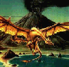
Old dragons get tired but they can still flame. Beware!
Old dragons get tired but they can still flame. Beware!
-
LindsWalters
- Posts: 26
- Joined: Mon Aug 29, 2011 7:22 pm
Re: Project 1 - Melissa Armstrong
Love the picture of your background with it being Downtown Reno. You must have played with it in photoshop, because the brightness and colors are so there. The way you have your project buttons for project 2 and 3 are really thought full. Its like you know what are state, and city is about. 
Lindsey Walters