
http://grc175.com/student/fall_2011/ash ... index.html
I got my friend Paola Fernandez to help me out with this project in putting it together in dreamweaver, because a lot of the things we've gone over in class kinda blew out the window for me. I also have to work with CS3 at home, so the layout looks a bit different than the CS5 version at school.
Feel free to give me feedback and criticism, but I don't know how much more I can do with it, but I guess that's why I'm posting it here.
Sorry about my use of arial font in some of these pages.
:>
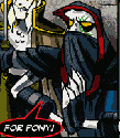
My site is up now!

Re: My site is up now!
It looks really good to me. I don't have any suggestions.
Arlene Williams
Old dragons get tired but they can still flame. Beware!
Old dragons get tired but they can still flame. Beware!
-
Instructor

- Site Admin
- Posts: 1869
- Joined: Thu Jul 21, 2011 8:51 am
Re: My site is up now!
Looking very good to me. It has a great sense of ... enraged whimsy. Looks like it's got good navigation. I had no trouble finding my way around it. Excellent work. Very expressive.
My only suggestion would be to center the design in the background.
Don't worry about the CS3 to CS5 translation, CSS and HTML files are universal so they'll work fine version to version. Heck, if you learn the programming languages, you won't even notice the difference!
Also feel free to keep picking Paola's brain on this stuff. She was one of my start students and really knows this stuff backwards and forwards.
"Inspiration is for amateurs. The rest of us just show up and get to work." — Chuck Close
Michael Ganschow-Green - GRC 175 Instructor
mganschow@tmcc.edu | 673-8200 ext.5-2173
Michael Ganschow-Green - GRC 175 Instructor
mganschow@tmcc.edu | 673-8200 ext.5-2173

Re: My site is up now!
Looks good, like the drawn on lined paper look you have going. I agree though centering it would help out. Just looks weird stuck in the left corner.
Kyle Smith
-
miss_kristine

- Posts: 67
- Joined: Mon Aug 29, 2011 7:21 pm
- Location: reno,nv
- Contact:
Re: My site is up now!
Turned out wonderfully! I agree the design would be best centered.
Kristine Toward

Re: My site is up now!
I agree that it would be a plus if the site was centered. But other than that, very cute site. I really like the navigation of your site, very simple + cute.
Vy Tat...
-
brienicole

- Posts: 132
- Joined: Mon Aug 29, 2011 5:02 pm
- Location: Sparks, Nevada
Re: My site is up now!
Im with the PP and think it needs to be centered. But also the text off the lines is a bit errrr off. But as we learn more that may be solvable. I suppose you could write those in and scan?
~Brianne Porterfield
"What a crazy random happenstance!"
"What a crazy random happenstance!"
Re: My site is up now!
try adjusting the "line-height" property in CSS. (you can limit it to just that element - your content DIV for instance - so it doesn't mess up anything else. For print people, line-height is leading (if I recall correctly).brienicole wrote:Im with the PP and think it needs to be centered. But also the text off the lines is a bit errrr off. But as we learn more that may be solvable. I suppose you could write those in and scan?
This post has been brought to you by the letter X, the number 5, and Larry Rubald.
"It's irony at a base level, but I like it." ~Bill Hicks
"It's irony at a base level, but I like it." ~Bill Hicks
Re: My site is up now!
Thank you all for the feedback. For the most part, I was able to somewhat center the website (but remains at the top) and reupload it, but for some reason, in safari, it remains in the upper left hand corner even though in the preview in dreamweaver in the same browser, it was in the center like I asked. Because I'm not a css/web genius atm, I am not going to figure out why this is and I'll settle for this.
For the text on the lines, I'm not concerned atm just because I'm afraid to touch the css more in fear I'll destroy the thing, but if I know later how to line the text up better, I'll try fixing it. C: And just from my expectations and my friend Paola's feedback, I figured Mike would want some real type in our website somewhere. I did consider just writing it out by hand and putting it in as a graphic! Maybe if that's ok, I'll do that instead later on for this particular one.
For the text on the lines, I'm not concerned atm just because I'm afraid to touch the css more in fear I'll destroy the thing, but if I know later how to line the text up better, I'll try fixing it. C: And just from my expectations and my friend Paola's feedback, I figured Mike would want some real type in our website somewhere. I did consider just writing it out by hand and putting it in as a graphic! Maybe if that's ok, I'll do that instead later on for this particular one.
Ashlie Nelson

Re: My site is up now!
Love it!
Love it!
Love it!
While doing my research I came across a few sites that were 100% hand drawn. That seems to be a popular design choice nowadays. Sometimes it works and sometimes it doesn't but with your design... it works.
And on any other site "spilled paint" in the middle of the page would look like a mistake. With yours it makes it clear that it's a design choice. I love that.
Love it!
Love it!
While doing my research I came across a few sites that were 100% hand drawn. That seems to be a popular design choice nowadays. Sometimes it works and sometimes it doesn't but with your design... it works.
And on any other site "spilled paint" in the middle of the page would look like a mistake. With yours it makes it clear that it's a design choice. I love that.
- Nathan Lundholm