
Hello everyone!
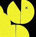
I took all the great feedback that everyone gave me and I decided to go with my second design. I took some of my shapes and gave them more of a geometrical feeling to create more visual interest. I adjusted the background color to make everything pop a little more. I added a drop shadow to my type to make it a bolder and more legible, I also adjusted some of the margins. Let me know what you all think!
Project 1 ~ Final
Project 1 ~ Final
- Attachments
-
"A day without laughter is a day wasted." - Charlie Chaplin
Brianna Mick
Brianna Mick
-
Ariesboxsye

- Posts: 76
- Joined: Wed Aug 30, 2017 5:10 pm
Re: Project 1 ~ Final
I like where this is going over all, its very stylized and good use of shapes to create an abstract design over all. Font's still feel too basic for me however, and the body copy seems to become hard to read with how thin that typeface is.
~Names Aries Shelley~
-
Kyler_Rose
- Posts: 97
- Joined: Wed Aug 30, 2017 5:11 pm
Re: Project 1 ~ Final
Your website is looking good, I like the use of the diamonds for your projects, but your paragraph just seems placed there and doesnt go with the design of the website.
Kyler Rose

Re: Project 1 ~ Final
Hello!
I really like your geometric design. Adds a lot of interest and dimension. I also like how you used the color. What I would do is change the typeface you used for the body copy. It is hard to read and could be integrated into your design better. Otherwise, I think it's great.
I really like your geometric design. Adds a lot of interest and dimension. I also like how you used the color. What I would do is change the typeface you used for the body copy. It is hard to read and could be integrated into your design better. Otherwise, I think it's great.
Susie Lang
-
erika.murray

- Posts: 83
- Joined: Thu Aug 31, 2017 10:12 am
Re: Project 1 ~ Final
I love the different styles that you gave to the shapes. Your colors are nice as well. Since you changed your background color, it makes the overall type hard to read. I also feel that you need to change your Project text to white, or lighten the shapes that the text is on. The type at the bottom of the page was better in your preliminary. Links could be a little smaller so that it is not as crowded in the shape. Great work!
Fate, my friend, you say the strangest things
Erika Murray
Erika Murray
Re: Project 1 ~ Final
Your website has a lot of great texture to it! I would suggest changing the font of your bio, because it is a bit hard to read.

-
selvster5000
- Posts: 84
- Joined: Wed Aug 30, 2017 5:09 pm
Re: Project 1 ~ Final
I love how you incorporated more geometrical shapes to your design, as well as,
your awesome color scheme. The added drop shadows to your text is a nice touch
too. Although I do agree with Erica to change the body/link color. The black text
is a little hard to read on the diamonds. Overall, nicely done!
your awesome color scheme. The added drop shadows to your text is a nice touch
too. Although I do agree with Erica to change the body/link color. The black text
is a little hard to read on the diamonds. Overall, nicely done!
Cheers,
Hannah Selvey
Hannah Selvey

Re: Project 1 ~ Final
I love it!!!! Its so pretty with the colors and patterns. I cant wait to see the working website!
b
Darian Potichny
Darian Potichny
-
Instructor

- Site Admin
- Posts: 1909
- Joined: Thu Jul 21, 2011 8:51 am
Re: Project 1 ~ Final
Geometry! Even more crystals! This one also includes a nice diagonal gradient.
I really like the introduction of the strokes and inner line work. I also like what you've done with your patterns. Deepening them walks away from the Justin Maller look, but adds depth and texture and I really like the way it looks. Almost like little doorways to parallel universes. That gradient was really an inspired addition. It helps guide the eye from one corner to the other and reinforces the directionality you've established with your crystals. I like the bolder navigation type too. Good choice on that.
Your margins are better, but still a little tight at the bottom left corner of your bodycopy paragraph and the bottom left corner of the first line of your title.
Nice work!
"Inspiration is for amateurs. The rest of us just show up and get to work." — Chuck Close
Michael Ganschow-Green - GRC 175 Instructor
mganschow@tmcc.edu | 673-8200 ext.5-2173
Michael Ganschow-Green - GRC 175 Instructor
mganschow@tmcc.edu | 673-8200 ext.5-2173
Re: Project 1 ~ Final
The website design is looking sharp! I like the variety of the diamond shapes. The color in the background works, but the links section is lighter in color value making it compete with the name at the top or the contact info at the bottom. The design is really unified with the shapes and fonts used. The color scheme is visually appealing.
Melissa Peel