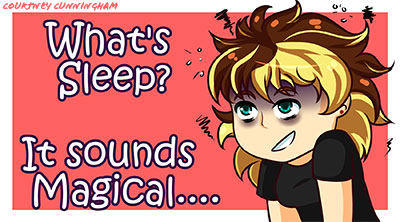
I've decided to go with a combination of both designs. a lot of people like the colors of the first one but the flow of the second one, so I thought Why Not?! I also fix the margins, change the purple buttons to do gradient blue, and fix the body copy.
It the final design i will add more details to my character and play with the margins. Thanks everyone for your help!
Final Rough
- Ariesboxsye
- Posts: 76
- Joined: Wed Aug 30, 2017 5:10 pm
Re: Final Rough
The use of the cursive style font and gradient looking buttons are my favorite in this design. Body copy font feels a bit lost with the light magenta background, I would see if a drop shadow might help with bringing it forward a bit and adding legibility.
~Names Aries Shelley~
-
Kyler_Rose
- Posts: 97
- Joined: Wed Aug 30, 2017 5:11 pm
Re: Final Rough
Your Website is looking good, It is now alot easier to read the text compared to the old one. Over all everything thing looks great and I have no suggestions on how to improve it.
Kyler Rose


-
Ltrueworthy
- Posts: 25
- Joined: Wed Aug 30, 2017 5:11 pm
Re: Final Rough
I love how happy and open your layout is. My only thought is that the drawing of you, the head looks a little small compared to the rest of your body, besides that I love the colors and how everything flows really well.
Good Job
Good Job
Lea Trueworthy


Re: Final Rough
Your layout is very happy and light. Illustrations are very cool. Good use of color. Would make some changes to your body copy. it is not very legible. Cool site. Can see how talented you are.
Susie Lang
- erika.murray
- Posts: 83
- Joined: Thu Aug 31, 2017 10:12 am
Re: Final Rough
I like the blue with the pink and the gradient that you have going on the with the nav buttons. Maybe you could add a very subtle gradient to your pink background. I know your body copy is justified, but could you try to get the word "do" back into the last sentence? It doesn't look right when it's hanging off at the bottom.
Fate, my friend, you say the strangest things
Erika Murray
Erika Murray
-
selvster5000
- Posts: 84
- Joined: Wed Aug 30, 2017 5:09 pm
Re: Final Rough
I think both designs combined worked well for you. The gradient buttons are
visually pleasing as well as your detailed anime character. The white body text
is still a little hard to read, I may try to go with a different color for it. But
great progress!
visually pleasing as well as your detailed anime character. The white body text
is still a little hard to read, I may try to go with a different color for it. But
great progress!
Cheers,
Hannah Selvey
Hannah Selvey
Re: Final Rough
This looks very whimsical and cute. I would suggest changing your justification in the bodycopy so that there are no gaps in between words. I like that you added your own illustrations 
- Instructor
- Site Admin
- Posts: 1939
- Joined: Thu Jul 21, 2011 8:51 am
Re: Final Rough
Ooooh! This one's noticeably better.
Just putting a gradient in your navigation really worked wonders. It adds an extra bit of visual interest to everything. Your resized and shifted navigational type is helping too. Your button margins are working to make everything feel not quite so mashed together. Heck, the overall margins around the document edge are pretty good. I'm glad you condensed the bodycopy down a bit too so we can actually see cartoon-you. I like the new color scheme too, though I don't think it would have worked as well without the navigational gradient.
The margin above the navigation is a little tight to the edge of the page. I think it would look better just a little lower.
What a great improvemt! Nice work.
"Inspiration is for amateurs. The rest of us just show up and get to work." — Chuck Close
Michael Ganschow-Green - GRC 175 Instructor
mganschow@tmcc.edu | 673-8200 ext.5-2173
Michael Ganschow-Green - GRC 175 Instructor
mganschow@tmcc.edu | 673-8200 ext.5-2173
Re: Final Rough
Hello,
The blue nav buttons are working well to complement the red. The body copy has the word "do" at the bottom. Adjusting the font or textbox size so it is included in the line above it would make it less left out. The image and fonts are fun and match the anime theme well.
The blue nav buttons are working well to complement the red. The body copy has the word "do" at the bottom. Adjusting the font or textbox size so it is included in the line above it would make it less left out. The image and fonts are fun and match the anime theme well.
Melissa Peel


