Page 1 of 2
Project 01 Final
Posted: Fri Feb 26, 2021 11:52 pm
by IzzyB
Hello Everyone!
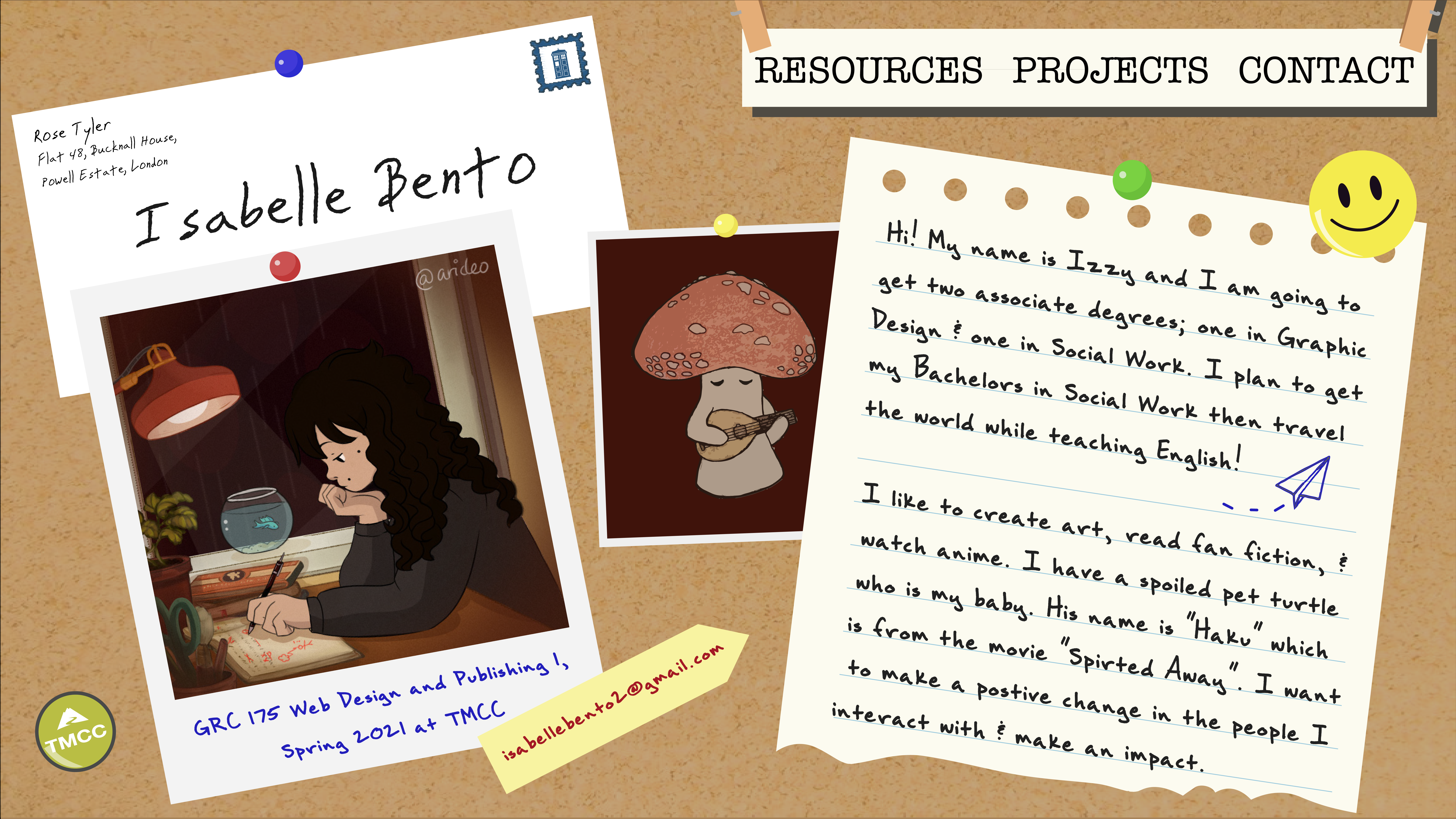
I decided to go with the Bulletin Board idea as I liked it better and thought I could add a lot more to the design this way. I noticed I did not have the TMCC logo so I made it into a button

I also added my name, that way people know who I am. I decided to make it an envelope, can you get the reference

The mushroom is an actual picture I drew in my sketchbook and I imported it.
Here are the websites that inspired me:
https://koox.co.uk/
This one inspired me to layer my designs as well as make things similar but different
https://ispy.heihei.resn.co/
I like how interactive this one is. You can also click lots of different things which I think is an interesting concept

- final.png (4.66 MiB) Viewed 1391 times
Re: Project 01 Final
Posted: Mon Mar 01, 2021 1:33 pm
by Anayik
Hi Isabelle, you definitely nailed the bulletin board look. I like the envelope idea with your name on it. And your little mushroom character is super cute! Very well executed overall, its tricky to bring so many varying elements together and make them work
Re: Project 01 Final
Posted: Mon Mar 01, 2021 4:53 pm
by Krueckl
Hi Isabelle,
You layout is nice. It has a cute bulletin board style. I like the little push pins and tmcc logo push pin. Good job.
Re: Project 01 Final
Posted: Wed Mar 03, 2021 8:39 am
by gavin_clouser
Extremely creative. This is cool. The layout is good, elements are creative, and its just unique to look at. It will definitely make an impression on future clients.
Re: Project 01 Final
Posted: Wed Mar 03, 2021 10:53 am
by Kassandra
Hi Isabelle,
I love that your design is unique and different from the usual web design layouts I have seen. Adding the TMCC logo as a button is a great idea and it just looks cute! The font choices work great together and everything looks balanced to me.
Re: Project 01 Final
Posted: Wed Mar 03, 2021 8:34 pm
by Hamistani
Hello Izzy,
I love everything down to the Tardis stamp! The envelope adds to the bulletin board, and I love how you turned the TMCC logo into a button. If it were me, I would make the picture of the girl lean the opposite way of the envelope. It will make the bulletin board a bit messier. I love this and am looking forward to seeing it in action!

Re: Project 01 Final
Posted: Thu Mar 04, 2021 1:21 pm
by sal_baraj
Hi Izzy,
This is a cool layout! You can see that this is a graphic designers webpage, it really captures your personality. Great execution!
Re: Project 01 Final
Posted: Thu Mar 04, 2021 1:41 pm
by dearangela
Hey Izzy,
First of all, LOVE the TMCC push pin, such a great idea. I do notice, the TMCC push pin has an outline while the others do not, just something to point out maybe it can be a little lighter to blend downward? Other than that, I love the whole idea of your composition, and gives me an intro to a video game or something very interactive, can't wait to see what you can do next.
Re: Project 01 Final
Posted: Thu Mar 04, 2021 3:32 pm
by Instructor
Ayyyyyy, you went with the cork board one. Excellent!
Looks like you've completely kicked out the jams and just covered this thing in detail since the preliminary critique. I approve! Everything from the TMCC button to the push pins to the happy face to the letter from your space-time pen pal creates a lived-in, realistic aesthetic that helps sell your skeuomorphism. Heck, your cork texture even looks a little better. I don't even mind the loss of the drop shadows. Basically, it looks like everything is mashed up against the board, which is fine. That "Lo-Fi Beats for Studying" self-portrait is still cracking me up. I threw some on when I cracked this thread open. Get me in the vibe. The mushrooom is helping to. He looks pretty lo-fi too. Usually, I complain about too many fonts on a website, but that chaotic energy is desired here. And usually I complain about tight margins, but what tight margins you have here (left and right of your nav, bottom of your torn paper) give it an offhand thrown together feeling, which is what you were going for here. Inspite of all your deliberate chaos, it's actually easy to find and read your content. Your navigation sticks out and is easy to find and use as well. And now I find myself smiling at the happy face.
I'm actually having trouble finding much to rap you about aside from the tight left and right margins on your navigation. Anything I'd poke at could be a deliberate attempt to make it look sloppy and home made. I think you hacked the system.
Great work! This is one to be proud of and cherish.
Re: Project 01 Final
Posted: Thu Mar 04, 2021 6:23 pm
by ItsAllisxn
Hi Izzy!
I LOVE THE LAYOUT!! The pegboard theme is so cool. I can't help myself but to admire the small details in this, such as the shading in the little pins and the adorable TMCC pin. I also really really like the mushroom that you added, I think it really compliments the lofi hip hop radio picture you have. The handwritten-like fonts, chef's kiss. I like the little Easter egg in the mobile version with the street name

. Great job!!

