
Thanks everyone for the great feedback. I appreciate all of your suggestions, and agree. So I have done some fiddling with the text. I would like to hear what y'all think about the updated design.
Thanks
Denise
updated project 1

Re: updated project 1
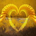
Such a strong, rich picture. Love it!
Try a version of the site with the button type even smaller. maybe san-serif. Try sampling the cream/white color from the paint in your picture for the color of the button type.
and this is such a non-issue, but I noticed it and now can't let it go. the dot on the i and the apostrophe in the word Deni's is so close. The apostrophe is shaped like an accent. I'm thinking you should increase the kerning between the dot and the apostrophe to avoid any confusion that the i is accented. Now isn't that silly? I know....

Re: updated project 1
Maybe we are getting picky but I just had a thought, could you try a version of the buttons maybe along the bottom or top, like where the green strip is? I don't know why but I still feel like the buttons are kinda being shoved into that space, and I'm thinking i would like to see them not so confined to that area...I think it would help emphasize your photography and keep the focus on the image, im still being attracted to just reading the buttons right now and not focusing on this great image. If you have time to give it a try and post it that would be great, im curious to see if it makes a difference.
Faith
Faith
"Design is simply thinking made visual"
Re: updated project 1
Thanks again for the great feedback. I moved the links to the top and made the text smaller and I like it a lot better. I, too, was feeling like they were all scrunched up on the left. 
- Attachments
-

Re: updated project 1
I really like the links at the top, it looks way more elegant!

Re: updated project 1
The links on the top is working much better than having them in the photograph.

Re: updated project 1
YES! I like the links there....it opened it up and your image is now the main focus, great job! I think it flows very nice now and i don't see any conflict within the layout. Awesome!
"Design is simply thinking made visual"
Re: updated project 1
WINNER, WINNER, CHICKEN DINNER!!!!
Yes, I too, love the buttons across the top.
Yes, I too, love the buttons across the top.
Re: updated project 1
Excellent homepage. It really looks good with the buttons moved to the top, I didn't realize how distracting they were from the image.
I'm impressed with how much difference the simplest tweaks will make.
I'm impressed with how much difference the simplest tweaks will make.
-
artgalstyle
- Posts: 121
- Joined: Mon Jan 23, 2012 8:19 pm
Re: updated project 1
Wow, great job. Love both but the second I think works the best. Lovely!
Laramie
Laramie