
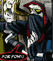
not sure about the body yet. If I have it white it seems to clash with my definition at the top. So I have it a slight gray. Couldnt really make the seamless chalkboard work so I went with stars ( being that it is a Doctor Who theme) ideas. thoughts?
http://www.grc175.com/student/fall_2011 ... rterfield/
Working site is up
-
brienicole

- Posts: 132
- Joined: Mon Aug 29, 2011 5:02 pm
- Location: Sparks, Nevada
Working site is up
~Brianne Porterfield
"What a crazy random happenstance!"
"What a crazy random happenstance!"

Re: Working site is up
It looks very good except for some reason the body copy seems too "long" or perhaps needs to be indented. Could be just my eye, but usually I see that kind of text in shorter lines. The long line works great at the top, but hits me wrong in the body copy and it sort of competes with the long lines at the top. Maybe it could wrap around the phone booth? Is that possible? I am not sure.
Arlene Williams
Old dragons get tired but they can still flame. Beware!
Old dragons get tired but they can still flame. Beware!
-
brienicole
- Posts: 132
- Joined: Mon Aug 29, 2011 5:02 pm
- Location: Sparks, Nevada
Re: Working site is up
Yes I agree. Thats where Im struggling at the moment. I may have to go and redo my slices to achieve getting that in more...Ill keep playing
~Brianne Porterfield
"What a crazy random happenstance!"
"What a crazy random happenstance!"
-
brienicole
- Posts: 132
- Joined: Mon Aug 29, 2011 5:02 pm
- Location: Sparks, Nevada
Re: Working site is up
Okay I tried a fix. check it now. ( you may need to refresh)
~Brianne Porterfield
"What a crazy random happenstance!"
"What a crazy random happenstance!"
-
Instructor

- Site Admin
- Posts: 1869
- Joined: Thu Jul 21, 2011 8:51 am
Re: Working site is up
After seeing the design I shall provide feedback in the voice of a Dalek:
EXTERMINATE WEB-SITES! Very niCE LOOKING! I like the use of the transPARENT PNG ON THE BOARD to make it look LIKE ITS "SCRIBBLED ON THE COSMOS"! The half erased subtleties are A NICE TOUCH AS WELL! It's a Dr. Who TRIVIA CONTEST! EXTERMINATE TRIVIA CON-TESTS! I think I got 90% OF THEM! Good use of easter EGGS ALL THE WAY AROUND! EXTERMINATE EASTER EGGS!
I'd bold the bodycopy to MATCH THE OTHER BOARD SCRIBBLINGS, it's getting a little lost IN THE BOARD TEXTURE RIGHT NOW! EXTERMINATE BODY-COPY! Also, I'd make the background color of the div tag that CONTAINS YOUR TYPE A SIMILAR GRAY-BLUE TO YOUR BLACKBOARD. If the interwebz are a little slow in loading the background image, the TYPE GET'S LOST UNTIL THE IMAGE LOADS! EXTERMINATE THE INTERNET!
And that's my opinion.
"Inspiration is for amateurs. The rest of us just show up and get to work." — Chuck Close
Michael Ganschow-Green - GRC 175 Instructor
mganschow@tmcc.edu | 673-8200 ext.5-2173
Michael Ganschow-Green - GRC 175 Instructor
mganschow@tmcc.edu | 673-8200 ext.5-2173
-
brienicole
- Posts: 132
- Joined: Mon Aug 29, 2011 5:02 pm
- Location: Sparks, Nevada
Re: Working site is up
haha love it!
Well that is the bold font for that set of fonts. I can get it bolder if I use the san serfs but with my other fonts being serifs Im not sure using a sans looks quite right. ackkk
Well that is the bold font for that set of fonts. I can get it bolder if I use the san serfs but with my other fonts being serifs Im not sure using a sans looks quite right. ackkk
~Brianne Porterfield
"What a crazy random happenstance!"
"What a crazy random happenstance!"
Re: Working site is up
TARDIS is an acronym, not a word. (But you knew this, I can tell from the background. ^_^ ) All caps. 
On a side note, this is by far my favorite design of the whole class. But, I'm an uber-nerd, soooo...... yeah.
On a side note, this is by far my favorite design of the whole class. But, I'm an uber-nerd, soooo...... yeah.
This post has been brought to you by the letter X, the number 5, and Larry Rubald.
"It's irony at a base level, but I like it." ~Bill Hicks
"It's irony at a base level, but I like it." ~Bill Hicks
-
brienicole
- Posts: 132
- Joined: Mon Aug 29, 2011 5:02 pm
- Location: Sparks, Nevada
Re: Working site is up
ahh thank you Larry! Ya I know about the TARDIS but it looked weird.. Ill still play
~Brianne Porterfield
"What a crazy random happenstance!"
"What a crazy random happenstance!"
-
Instructor
- Site Admin
- Posts: 1869
- Joined: Thu Jul 21, 2011 8:51 am
Re: Working site is up
In lieu of using a bold font, why not play around with bolding it via CSS?brienicole wrote:haha love it!
Well that is the bold font for that set of fonts. I can get it bolder if I use the san serfs but with my other fonts being serifs Im not sure using a sans looks quite right. ackkk
I'll discuss font modification, including bolding, in class tomorrow.
"Inspiration is for amateurs. The rest of us just show up and get to work." — Chuck Close
Michael Ganschow-Green - GRC 175 Instructor
mganschow@tmcc.edu | 673-8200 ext.5-2173
Michael Ganschow-Green - GRC 175 Instructor
mganschow@tmcc.edu | 673-8200 ext.5-2173
-
brienicole
- Posts: 132
- Joined: Mon Aug 29, 2011 5:02 pm
- Location: Sparks, Nevada
Re: Working site is up
okay, then Ill wait till class so I can figure that one out!
~Brianne Porterfield
"What a crazy random happenstance!"
"What a crazy random happenstance!"