
rough_1 and rough_2
-
elizabeth_mccurdy
- Posts: 36
- Joined: Tue Jan 24, 2017 7:03 pm
rough_1 and rough_2
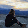
Hello every one my name is Elizabeth McCurdy these are my two rough drafts. I wanted to use one of my designs that I had made before in a different class. I wanted to show some of my creativity in the page but also some of my previous work. I used these webpages for some ideas: https://colorlib.com/wp/flat-design-wordpress-theme/e and http://www.foob.be/designselection/webdesign.html. I want to work more with this project by putting more shades and organization, but this is just the rough draft and I would like to read your opinions and see what you think about these ideas.
- Attachments
-
- I tried to keep the different parts of the page around the same size physically. All parts have good details.
-
- In this rough I want to show a big picture and design to catch the eye of the people and show the information.
Elizabeth McCurdy
Re: rough_1 and rough_2
Hi Elizabeth,
I think the second design works best, I like how large the illustration is. For that one, I would just make your email address stand out more.
The first design is also interesting, I like the navigation bar and the typeface you used for your name. If you chose to go with that one, maybe replace the large TMCC logo with one of your creations, and put the TMCC logo at the bottom?
- Stephanie Kendziorski.
Re: rough_1 and rough_2
Hi Allie:
I really like your "rough_1.jpg" the most out of both roughs. Everything is very clear and easy to see. Your bio text color is perfectly visible. I like that the lighter image of the blowing bubbles is in between the darker header & navigation areas. Looks very nice. I like that you put the typically footer material at the top of your page since the nav bar is at the very bottom. My suggestion would be to maybe shrink the TMCC logo a bit and maybe us a lighter weight on the GRC... text font.
Great work!

-
Instructor

- Site Admin
- Posts: 1945
- Joined: Thu Jul 21, 2011 8:51 am
Re: rough_1 and rough_2
Ooooh, looks like we've got a different look here.
I really like your second design. It has a great sense of motion. The large portrait is eye catching and having it blowing at the bodycopy moves they eye from the immediate visual center (the portrait) to the information. That bubble type you're using for your navigation and headlines is really working well also. I'm not usually a fan of specialty typefaces, but here, beacuse of the portrait, it works. The blues go well with the composition and allow the reds and browns in the portrait to stand out. Good use of split complimentary there. I also like the use of the header and footer as framing devices to further funnel the eye toward the portrait. Putting the navigation in the footer is a bold move that is paying off so far. I'm curious to see how it will go.
You've got a font too many in my opinion. I'd pull the serif type from your top bar and just sue the sans-serif you have for your bodycopy. Also, I wouldn't have the bodycopy in a bold font. Regular will do you just fine. You can also yank the green from behind the TMCC logo. It clashes and TMCC's branding guidelines don't require the green.
I like the style these are done in. Good job!
"Inspiration is for amateurs. The rest of us just show up and get to work." — Chuck Close
Michael Ganschow-Green - GRC 175 Instructor
mganschow@tmcc.edu | 673-8200 ext.5-2173
Michael Ganschow-Green - GRC 175 Instructor
mganschow@tmcc.edu | 673-8200 ext.5-2173
Re: rough_1 and rough_2
I like the second design better of the two. I'm really enjoying the playfullness of the image you chose to include and the bubbles add a sense of movement helping the viewer look at everything without thinking about it. I have to agree with Michael again, one of the first things I noticed was too many fonts. The bubble font works really well with your image so you should keep that and the serif font feels too formal for such a playful design. Nice work!
BreeAnn St.Onge
-
sarah.alvarado
- Posts: 15
- Joined: Tue Jan 24, 2017 6:47 pm
Re: rough_1 and rough_2
Hello Elizabeth,
I really enjoy your second design! Your main image is very nicely rendered and adds a great visual. The color of your text is a nice contrast against the background and surprisingly easy to read. I would suggest moving your nav bar up since it took me a moment to find exactly where it was. Great job and I hope to see more!
I really enjoy your second design! Your main image is very nicely rendered and adds a great visual. The color of your text is a nice contrast against the background and surprisingly easy to read. I would suggest moving your nav bar up since it took me a moment to find exactly where it was. Great job and I hope to see more!
Sarah Alvarado
"Always speak politely to an enraged dragon" - Steven Brust
"Always speak politely to an enraged dragon" - Steven Brust
-
IvorHarvey

- Posts: 49
- Joined: Thu Jan 26, 2017 12:32 pm
Re: rough_1 and rough_2
I would have to agree and say that the second design works better of the two. The use of the large image helps create interest instead of using a plain blue background. I would suggest moving the other links bar at the bottom to the top of the page so it's easier to navigate between pages. The overall color scheme works well with the "bubbly" theme, and the text is still easy to read with the background image.
-Ivor
-Ivor
Ivor Harvey