
Hello, my name is Eduardo Garcia, and these are my two roughs.
Judge them as much as you want.
Inspirational website #1:http://www.twelveskip.com/showcase/webs ... t-me-pages
Inspirational website #2:http://www.designer-daily.com/portfolio-desig-10009
^^^^ The reason for why I found these two websites inspirational is because both websites give amazing examples on portfolios.
Both display wonderful design choices on where to place the navigability, the design of the website, unique website designs, proper text management,
simple yet interesting website designs.
Project 1 - Preliminary Critique
Project 1 - Preliminary Critique
- Attachments
-
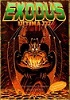
- Rough #1
-
- Rough #2
Last edited by EduardoG on Wed Feb 08, 2017 5:28 pm, edited 1 time in total.
- Eduardo Garcia
Re: Project 1 - Preliminary Critique
Hi Eduardo,
I like both but the rough #2 is the one I like. I like the layout, colors and the background. The tmcc logo seems too close to the grc text. And maybe a white logo! And the font color that contains your name, spring 2017 needs to be lighter. Gets a little lost. Maybe the same color as your body text.
I like both but the rough #2 is the one I like. I like the layout, colors and the background. The tmcc logo seems too close to the grc text. And maybe a white logo! And the font color that contains your name, spring 2017 needs to be lighter. Gets a little lost. Maybe the same color as your body text.
Michele K Ott
Re: Project 1 - Preliminary Critique
Hi Eduardo:
It's good to see you in another GRC course! As far as your color choices, I love blue!! I like the saturated look of your "rough_width.jpg" a lot. I think using that bluish text for your bio instead of a white color is nice. This home page is simple and clean, but man it really POPS! My suggestion for this one would be to simply even out the spacing in your nav bar, unless your top button has been intentionally placed further away from the bottom two buttons.
I like the other one as well. I think it could benefit with some FX on the buttons and just a tad bit lighter with your name. You could totally trick out your name with some cool FX instead of using a lighter color too.

Re: Project 1 - Preliminary Critique
Eduardo,
The second design works best I think, I enjoy what you did with the background, it looks great! For that one I would just make your name stand out more, it blends in with the box behind it.
The first design is very bright, but the contrast with the black bar at the top works well. Maybe the color of your text (about yourself) should be less bright?
- Stephanie Kendziorski.
-
KKentera_5000
- Posts: 36
- Joined: Tue Jan 31, 2017 11:20 am
Re: Project 1 - Preliminary Critique
I like the bottom one, the patterns in the design are slick but not distracting, they compliment the information well and it is all legible. The only thing I would suggest is to maybe make the headline brighter or lighten it up by tinting it and just adjust the opacity of the drop shadow to make it pop a little more.
Kevin Kentera
Re: Project 1 - Preliminary Critique
Hi Edwardo,
I like the bottom design, the geometric shapes add a sense of movement that's nice. I feel like the tmcc logo is too big and bright, it almost feels like an advertisement for tmcc. Maybe make it smaller and change the color?
I like the bottom design, the geometric shapes add a sense of movement that's nice. I feel like the tmcc logo is too big and bright, it almost feels like an advertisement for tmcc. Maybe make it smaller and change the color?
BreeAnn St.Onge
-
Instructor

- Site Admin
- Posts: 1945
- Joined: Thu Jul 21, 2011 8:51 am
Re: Project 1 - Preliminary Critique
I like your second one. It looks like ice crystals. It reminds me of one of the electron microscope pictures of a snowflake where you can see the crystal structure. That diagonal shaping gives it motion and helps point the eye through from the navigation to your content. Your navigation is large and easy to use. Your header and footer act as great framing devices to help sharpen the point your website comes to. Your bodycopy is easy to read and I kind of like the rounded sans-serif typeface you chose.
You've got about a font too many, though. I'd pull out one of the two bold fonts you used, either your headline font or the header font and replace it with the other so you have a uniform bold font. I'd also use that font on your navigation pentagon buttons. Maybe play with transparency on those buttons too to go with the ice crystal look on the rest of the composition. Try the white version of the TMCC logo too, I think it'll clash less with your design.
Nice effort!
"Inspiration is for amateurs. The rest of us just show up and get to work." — Chuck Close
Michael Ganschow-Green - GRC 175 Instructor
mganschow@tmcc.edu | 673-8200 ext.5-2173
Michael Ganschow-Green - GRC 175 Instructor
mganschow@tmcc.edu | 673-8200 ext.5-2173
-
sarah.alvarado

- Posts: 15
- Joined: Tue Jan 24, 2017 6:47 pm
Re: Project 1 - Preliminary Critique
Hello Eduardo,
Your second design is very eye catching and exciting! I really enjoy your use of color as well! The shapes used give me a sense of motion, drawing my eyes toward your body text and combined with the color give me the feel of electricity. I would suggest darkening the color of your name so that it stands out from your background better. Great job and I can't wait to see more from you!
Your second design is very eye catching and exciting! I really enjoy your use of color as well! The shapes used give me a sense of motion, drawing my eyes toward your body text and combined with the color give me the feel of electricity. I would suggest darkening the color of your name so that it stands out from your background better. Great job and I can't wait to see more from you!
Sarah Alvarado
"Always speak politely to an enraged dragon" - Steven Brust
"Always speak politely to an enraged dragon" - Steven Brust
-
IvorHarvey

- Posts: 49
- Joined: Thu Jan 26, 2017 12:32 pm
Re: Project 1 - Preliminary Critique
Your second design I think is more interesting than the first, using the background to create movement through the page! I think it works better than having a solid background that the page is built on. Your name kind of gets lost against the background (even with that box behind it.) Also for both designs I would try to stick to two fonts, but ones that aren't trying to fight for the dominance in the design. I like the color choice for both, using different shades of blue to create contrast between the pieces.
-Ivor
-Ivor
Ivor Harvey