Meow (That's cat speak for "Here's my work")

Post links to your Project One websites for discussion and feedback.
User avatar
darian_p
Posts: 54
Joined: Mon Sep 04, 2017 11:58 am
Location: Everywhere

Meow (That's cat speak for "Here's my work")

Post by darian_p »

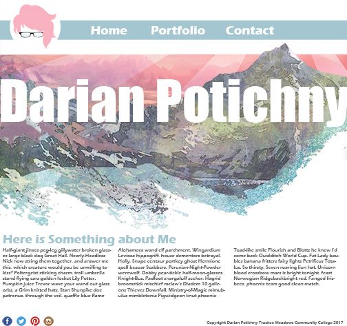
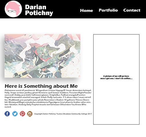
So theses are a few ideas I had. I don't really like the images so I'll probably changes those and re upload in the next dew days I'm just here for the points at the moment. Also the fonts will probably change later. I didn't want to go too crazy picking fonts right now if I'm going to change the images. This is ore just for layout I guess...
1st Draft:
Image
2nd Draft:
Image
bImage
Darian Potichny

chaytothet
Posts: 91
Joined: Wed Aug 30, 2017 5:08 pm

Re: Meow (That's cat speak for "Here's my work")

Post by chaytothet »

Hey Darian!

These are super awesome, I like the top because it really makes your name pop, I actually really like what that one has going on.
I wouldn't be disappointed to see the top one make the cut, but it's your project :)

Design on.
-Chalyn

Just because my path is different doesn't mean I'm lost
-Gerard Abrams

susielang
Posts: 86
Joined: Wed Aug 30, 2017 5:08 pm

Re: Meow (That's cat speak for "Here's my work")

Post by susielang »

Hi Darian,

Both of these designs are really great! I especially like the first one because your name really "pops". The colors are great.
Susie Lang

selvster5000
Posts: 84
Joined: Wed Aug 30, 2017 5:09 pm

Re: Meow (That's cat speak for "Here's my work")

Post by selvster5000 »

elloz!

Nice work! I really like your color scheme and how you played around with space in your two designs.
I personally like your second design a bit more than the first because it looks more like an actual website!
Good job. I also am fond of that white text on the back background. I would suggest to center the body
underneath the picture on the left hand side just to clean it up a bit :)

I really like where your going here!
Cheers,
Hannah Selvey

User avatar
Instructor
Site Admin
Posts: 1945
Joined: Thu Jul 21, 2011 8:51 am

Re: Meow (That's cat speak for "Here's my work")

Post by Instructor »

Meow to you too!

I like your personal logo. It has such character. And that's reflected in your compositions too.

I'm usually a sucker for good contrast, but with your designs I must make an exception. I really like your first one. It's super clean and I really like the whole watercolor/pastel effect. The full width watercolor image is really strong and immediately establishes the tone of the website. Using the colors from it throughout the rest of the composition really helps tie everything together. Your navigation bar is very strong and serves both an informational function (buttons to navigate the website) and an artistic function (highlight your logo mark). I like the large whitespace. It serves to enhance the cool refreshing quality the composition has. You've also used margins just about perfectly. Everything seems to have just the right amount of room to breathe.

Try justifying your text columns. I think the tight vertical rectangles would add another layer of cleanliness to the overall layout. Maybe move your bodycopy and headline down just a touch so that the spacing between the image and the navigation and the image and the copy are the same.

Excellent work!
"Inspiration is for amateurs. The rest of us just show up and get to work." — Chuck Close

Michael Ganschow-Green - GRC 175 Instructor
mganschow@tmcc.edu | 673-8200 ext.5-2173

User avatar
Pearl_Underwood
Posts: 63
Joined: Wed Aug 30, 2017 5:29 pm

Re: Meow (That's cat speak for "Here's my work")

Post by Pearl_Underwood »

I think these are both very nice. It was hard for me to decide which one I liked, but I guess I would have to choose the first. I like the full photo.
~Pearl Underwood~

Kyler_Rose
Posts: 97
Joined: Wed Aug 30, 2017 5:11 pm

Re: Meow (That's cat speak for "Here's my work")

Post by Kyler_Rose »

Both template are extremely well done i dont really have much to sugjet to change on yours but, Change your website so that it fits the requirements
-Link For Project 2
Link for Project 3
4 website links 2 for imforantion and 2 for inspiration
I would say go with your first template I thing that one looks better out of the two.
Kyler Rose

Image

User avatar
Ariesboxsye
Posts: 76
Joined: Wed Aug 30, 2017 5:10 pm

Re: Meow (That's cat speak for "Here's my work")

Post by Ariesboxsye »

Both look amazing with those images, but I would have to go with the second one simply because the image gives better hierarchy. Your font choice for your name I would suggest playing with to fit better with the image background, but not to lose it, simple Serif style doesn't fit for me.
~Names Aries Shelley~

User avatar
Zera-Chann
Posts: 57
Joined: Wed Aug 30, 2017 5:04 pm

Re: Meow (That's cat speak for "Here's my work")

Post by Zera-Chann »

Hey Dar!

I would say go with the first one it got more it's got a better layout and navigation and a really nice color scheme.

The only thing i would say is add buttons for Project 2, 3, just because criteria

Can't wait to see the finished work!
Image

User avatar
CarnutianDragon
Posts: 23
Joined: Wed Aug 30, 2017 5:07 pm

Re: Meow (That's cat speak for "Here's my work")

Post by CarnutianDragon »

Hi Darian,

Gosh, I just LOVE your first image. The way it disintegrates into the white of the page is so satisfying and wonderfully rendered. Suffice it to say that I'd choose your first design. There isn't much I would change except for changing your paragraphs from left align to left justified, just to make them neater.

Great job and I can't wait to see the finished product! :D
Sarah Alvarado

Locked