
Hello everyone! I'm Brady. I used your advice and worked on my website more.
I used the information from the websites to find out how I should start building my website. I also got to learn the basics of website design and what to do. I decided to give the design more color and shapes to fit my personality as requested.
My useful information websites:
1. https://webflow.com/blog/how-to-design- ... NkQAvD_BwE
2. https://www.smashingmagazine.com/2008/0 ... eb-design/
My design inspirations
1. https://www.amazon.com/?tag=amazusnavi- ... A8QAvD_BwE
2. https://en.wikipedia.org/wiki/Main_Page
I will be sure to work on the website later if something else comes to mind while I'm working on the other projects.
Project 01 Final
Re: Project 01 Final
Hi Brady! Good choice with the background, the shapes/colors compliment the red and orange nicely. Overall its easy to navigate and flows nicely, one suggestion would be to create a "resources" button in one of the orange squares where all your links can hide! Can't wait to see it live!
~*Jenna*
-
Instructor

- Site Admin
- Posts: 1945
- Joined: Thu Jul 21, 2011 8:51 am
Re: Project 01 Final
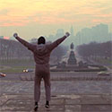
Aaaaaah! The haunting Elmo pic. Still hasn't gotten any less haunting the second time around.
Haunting Elmo pic aside, this layout has a lot going for it. I really like then multi-colored shape background. It helps move the eye through your nice, clean layout and the colors work well with your foreground oranges that you use on the rest of it. There are a lot of colors here, but they work well together. I like your logo as well. It'sd a good blend of fonts and colors. Makes me think of a cleaning company or some other business that's been open for a while. Typographically, this thing's pretty nice, too. I like your choice of one font with different weights to establish hierarchy. Nice work justifying your main bodycopy text area, it makes it into a nice block to be used in your composition. I like how you fit it into your green background block.
You don't need to put your whole link text in your buttons. Simply labeling the buttons where they go will suffice. Otherwise your poor users won't be able to tell where the buttons go. Also, the TMCC logo would look better in white or black. As it is, it blends in a little too much. I think it needs a little more space between your bodycopy and your "Brady Lennon" text and more space between "Brady Lennon" and your top bar.
Good effort!
"Inspiration is for amateurs. The rest of us just show up and get to work." — Chuck Close
Michael Ganschow-Green - GRC 175 Instructor
mganschow@tmcc.edu | 673-8200 ext.5-2173
Michael Ganschow-Green - GRC 175 Instructor
mganschow@tmcc.edu | 673-8200 ext.5-2173
Re: Project 01 Final
Hi Brady,
Good work going with a more dynamic background color. I still think you can get away from your boxes, but about viewing all the lectures, I can see now how this will play out to your advantage I would maybe try to add some buttons for links/references and projects instead of the boxes? Could be worth a try?? Maybe? Please? Pretty please? Looking forward to seeing what you do with your design moving forward!
Good work going with a more dynamic background color. I still think you can get away from your boxes, but about viewing all the lectures, I can see now how this will play out to your advantage
-Johnna Chism
Re: Project 01 Final
Hey Brady!
I like the changes you have made so far. I think the colorful shapes for sure add a lot and help make your design more interesting. It goes well with your personality. As others have said, consider getting rid of the extremely long links, they feel like they are dragging down the design overall. Nice job changing your name to a bolder typestyle. Great work!
I like the changes you have made so far. I think the colorful shapes for sure add a lot and help make your design more interesting. It goes well with your personality. As others have said, consider getting rid of the extremely long links, they feel like they are dragging down the design overall. Nice job changing your name to a bolder typestyle. Great work!
Isaac M!

Re: Project 01 Final
Howdy Doo Brady!
Im really enjoying the multi color backgrounds you have as it makes it more dynamic and less flat of a design. I think you should just have labels and buttons for your design instead of having a box that crams the link into it. Also I would fix your tmcc logo as its two different colors right now and its very displeasing to look at.
Love your work!
༼ つ ◕_◕ ༽つ Kai Madden just backflipped ༼ つ ◕_◕ ༽つ
-
kelseymarie_ba
- Posts: 106
- Joined: Tue Jan 24, 2023 7:47 pm
Re: Project 01 Final
Hey Brady,
I think your layout looks fun and gives me a 90's feel to it. Elmo fits nicely with it, haha. I think something that you can work on is giving the border on your buttons and the bar at the top a different color, it does help it stand out but I think with your color choice, you can try using a lighter color to balance better with your design. You can possibly white or a lighter tint of the orange you're using. Hope that helps, good work!
Kelsey Bautista
-
lil_cactux
- Posts: 84
- Joined: Tue Feb 07, 2023 2:03 pm
Re: Project 01 Final
Great job Brady! I love your shapes and colors and photo! These are just so creative! I would up the font sizes so they dont get lost in all the fun but overall these are great!
-
Hinata_Sato

- Posts: 105
- Joined: Tue Jan 24, 2023 7:43 pm
Re: Project 01 Final
Hey Brady,
Nice changes! It looks a lot better and I like how you added some elements and more colors to the background. I think the colors added some "Elmo theme" to it and the colors are working pretty well with your layout! I don't know if this is your intention, but the colors of the tmcc logo are changing on "CC" so changing the colors to either white or other colors would work. My other suggestion is to move the body copy to the middle of the website version. I think it will balance more that way. Nice work!
Nice changes! It looks a lot better and I like how you added some elements and more colors to the background. I think the colors added some "Elmo theme" to it and the colors are working pretty well with your layout! I don't know if this is your intention, but the colors of the tmcc logo are changing on "CC" so changing the colors to either white or other colors would work. My other suggestion is to move the body copy to the middle of the website version. I think it will balance more that way. Nice work!
Hinata Sato
Re: Project 01 Final
Hi Brady,
I really like the style of your final design with the multi-colored blocks, it makes your design come out as really colorful and playful. The one thing I would change is the outline on the orange boxes, maybe making them a slightly darker shade of orange to help them blend in more with the extra colors you got going on. Also nice picture lol.
I really like the style of your final design with the multi-colored blocks, it makes your design come out as really colorful and playful. The one thing I would change is the outline on the orange boxes, maybe making them a slightly darker shade of orange to help them blend in more with the extra colors you got going on. Also nice picture lol.