
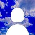
For my mobile page layouts I wanted to try to keep it simple and compact, so for inspiration I took ideas from the profile page on the mobile version of Pinterest and Instagram, but instead of having images and pictures I replaced it with the about me section, the project section, and the resources section. For the colors I kept it simple and made it different shades and hues of blue and red, and I tried to incorporate images in the backgrounds that fit with those colors, like the night sky or cherry blossom trees.
For my desktop website layouts I took inspiration from, again Pinterest, but a better example would be Dan Woodgers website https://danwoodger.com. I choose his site because of how straight to point his site is, his home page shows examples work and if you were to hold the mouse over it, it tells you what that specific project was for. Another huge help was Smash Magazine and this specific article for "Design Principles: Compositional, Symmetrical And Asymmetrical Balance"
I definitely plan on adding a lot more to my home page to make it more spruced up and unique, and hopefully by the time this project is finished there wont be as much empty space on the desktop homepage.
Resources: https://danwoodger.com
https://www.smashingmagazine.com/2015/0 ... asymmetry/
https://www.pinterest.com
Project One [Preliminary]
-
Vaporsotrue_JF
- Posts: 4
- Joined: Sun Feb 02, 2025 1:21 pm
Project One [Preliminary]
- Attachments
-
-
-
-
-Jacobo Fuentes Felix 


 [oooh mystery link!11!]https://www.youtube.com/watch?v=dQw4w9WgXcQ
-
Crane_Huang
- Posts: 19
- Joined: Mon Jan 27, 2025 2:57 pm
Re: Project One [Preliminary]
Hi Jacob,
Your mobile designs are very strong, everything feels cohesive and good for a user to navigate. The bars outlining the information is a great graphic to make it stand out. I do agree with you that the desktop homepage has some empty space that could be filled. I would recommend making your profile picture bigger and fit it into the design somehow. Nice backgrounds and graphics!
Your mobile designs are very strong, everything feels cohesive and good for a user to navigate. The bars outlining the information is a great graphic to make it stand out. I do agree with you that the desktop homepage has some empty space that could be filled. I would recommend making your profile picture bigger and fit it into the design somehow. Nice backgrounds and graphics!
-Crane Huang
-
fionahdez⋆˚✿˖°(๑'ᵕ'๑)⸝*

- Posts: 19
- Joined: Wed Jan 29, 2025 11:42 am
Re: Project One [Preliminary]
Hi Jacob,
Your designs are so fun! I love the colors and the way the two different layouts look, especially the blue mobile design. The only thing I'd say is perhaps have more space in between the borders of the different elements, like in the 'about me' in the first design the text seems a bit squished by the border of the text box.
Your designs are so fun! I love the colors and the way the two different layouts look, especially the blue mobile design. The only thing I'd say is perhaps have more space in between the borders of the different elements, like in the 'about me' in the first design the text seems a bit squished by the border of the text box.
✧˖°. 𝙵𝚒𝚘𝚗𝚊 𝙷𝚎𝚛𝚗𝚊𝚗𝚍𝚎𝚣 ‧₊˚ ⊹⋆
-
Kym_Griffith
- Posts: 13
- Joined: Sun Feb 02, 2025 3:31 pm
Re: Project One [Preliminary]
Hello Jacob,
Your designs are really fun and creative! The details you added like the notebooks and the stars really draw your eyes towards the text. Out off all the designs you did I think my favorite one has to be the red one just because it is really bold and pops out instantly, I also think it works nicely with the bold fonts you used.
The only thing that I would change is bringing down the "Resources" link down so its easier to distinguish it from the project one link.
Great Job!
~Kimberly Griffith
.......................ᕕ( ᐛ )ᕗ
.......................ᕕ( ᐛ )ᕗ
-
asullivan3106
- Posts: 19
- Joined: Sat Feb 01, 2025 9:28 am
Re: Project One [Preliminary]
Hi Jacobo,
I really like the starry night and cherry blossom designs you did in your layouts! I also like the creative direction you decided to go with your project links as well. However, I think in your starry night designs that if you put in some sort of graphic for your resources, like with your project links, it would look more like it belongs as a link on your page rather than a headline with no content. Other than that, I think you did an amazing job!
I really like the starry night and cherry blossom designs you did in your layouts! I also like the creative direction you decided to go with your project links as well. However, I think in your starry night designs that if you put in some sort of graphic for your resources, like with your project links, it would look more like it belongs as a link on your page rather than a headline with no content. Other than that, I think you did an amazing job!
- Allison Sullivan 
-
Jonnathan_ZepedaRojo
- Posts: 19
- Joined: Mon Jan 27, 2025 8:08 am
Re: Project One [Preliminary]
Hey Jacobo!
Your 2nd Design is so eye appealing! Very Readable, I see the order of importance, I would Recommend perhaps adding your name or that logo of you as a title right next to About me since your name is as important as every other title since I want to know who's website I am looking at.
I love the mobile layout of the 2nd design too, however, the background doesn't match the desktop layout. I would recommend making the background the same color as the desktop background.
Your 1st Design Mobile layout is actually perfect, the desktop layout needs a touch of reorganizing, I say you swap the Projects and Resources Box, so The projects would be in the box and resources would be the bar.
Really enjoyed the designs and concepts and I am excited to see the final product!
Jonnathan Zepeda-Rojo | JZR
-
kendra_mcaninch
- Posts: 18
- Joined: Thu Jan 30, 2025 7:23 pm
Re: Project One [Preliminary]
Hi Jacobo,
I really like both of the designs that you have created! They are both very different but also have the same sort of feel when looking at them. I feel like the red design condenses down to the phone layout better than the blue. I also really like "logo" or "emblem" that you have for yourself with the face and the JF under it. Overall I think that you did a really great job!
I really like both of the designs that you have created! They are both very different but also have the same sort of feel when looking at them. I feel like the red design condenses down to the phone layout better than the blue. I also really like "logo" or "emblem" that you have for yourself with the face and the JF under it. Overall I think that you did a really great job!
Kendra McAninch
-
quentin_debrabander
- Posts: 19
- Joined: Tue Jan 28, 2025 11:33 pm
Re: Project One [Preliminary]
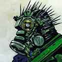
I like the seance one better. The blue and white text really stands out from each other. The logos for the links are really fun too. It’s very old school computer. I think you could do more with the white bar on the side. Your pic is good but perhaps it could use some more text or some industrial old computer stuff on it. Just to fit with the style. Or continue the background through into the white. I think the mobile version background could be a little darker to make the text pop more. It is a little tough to read. I really like the style though and I can’t wait to see it finished!
QUENTIN DEBRABANDER QUENTIN DEBRABANDER QUENTIN DEBRABANDER QUENTIN DEBRABANDER QUENTIN DEBRABANDER QUENTIN DEBRABANDER QUENTIN DEBRABANDER QUENTIN DEBRABANDER
-
Instructor

- Site Admin
- Posts: 1982
- Joined: Thu Jul 21, 2011 8:51 am
Re: Project One [Preliminary]
Looks like you have four different designs here rasther than a computer and mobile version of two. Of your four designs (which are all pretty good BTW), I like your last mobile design. It has your best margins and I like it's contrast.
It has a great background image that adds quite a lot of visual texture and is dark enough you can contrast your content with it. I like the clouds and night sky at the top and the way you've placed your portrait up in the clouds, Mufasa from Lion King style. I like the way your subheads bleed out from their containers too. Good use of contrast throughout. Your dark blues draw the eye and the white pops off of therm nicely. That really adds visual interest. Good choice on your typography as well. It looks like you made a really strong choice of just picking one font and then using different weights of it to establish hierarchy. I like the skeuomorphism of the clipped papers for your project buttons. Makes your navigation easy to find and use. I also like your little bling flourishes you have in your subheads and as a bottom accent in your bodycopy container.
Make sure to add the same amount of space between your Resources section and your project links as you have between your Portfolio header and your bodycopy container.
Nice work!
"Inspiration is for amateurs. The rest of us just show up and get to work." — Chuck Close
Michael Ganschow-Green - GRC 175 Instructor
mganschow@tmcc.edu | 673-8200 ext.5-2173
Michael Ganschow-Green - GRC 175 Instructor
mganschow@tmcc.edu | 673-8200 ext.5-2173
Re: Project One [Preliminary]
Hi Jacob, nice to meet you! I really enjoy both of your designs, but I think your second design works much better, the blues are nice and I've heard darker/cool colored websites tend to get more traction.. I think it could be fun if you tried to implement the cloud/sky imagery from your mobile version into your desktop one as well, just to add some consistency to your website if a user switches between devices. Great work!
Lucio Guerrero