
Good Morning, Evening, Afternoon, Or Night!
Jonnathan Zepeda-Rojo here with 3 Roughs For This Preliminary!
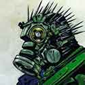
My 1st Rough focuses just on plain black and white, showcasing some of my works and buttons for the next projects.
My 2nd Rough is More Intwined with how a Portfolio would look with also a bit of color inspirations from different portfolios.
My 3rd Rough is focusing a lot on how I would feel a E-Sports Poster would look, More digital and Focusing On One Color!
I Used IdeasonPurpose website to help me figure out the qualities of a proper website, learning what's needed for QOL and more.
I used SesoHq and Crkdgg as inspirations for my work, I look up to Seso as hes a motivator for me to try and work in the esport industry, While Crkdgg is a gaming website that I feel has a very well done layout and design!
Finally I use Behance for portfolio Ideas, I definitely suggest grabbing ideas (Don't just take the designs off of Behance) and using Behance to help with the creative juices!
I hope you all enjoyed this, Please let me know which one you enjoy best and also why, or explain what I can improve on!
(Also note these are already roughs so there's definitely areas that can be changed and fixed!)
https://sesohq.com
https://crkd.gg
https://www.ideasonpurpose.com/on/7-qua ... t-website/
https://www.behance.net
Project 01 - Preliminary
-
Jonnathan_ZepedaRojo
- Posts: 19
- Joined: Mon Jan 27, 2025 8:08 am
-
Gerardo_GL0
- Posts: 4
- Joined: Mon Jan 27, 2025 7:40 pm
Re: Project 01 - Preliminary
Hey Jonathan,
I really like your third idea of keeping it based off of one color though the blue is really harsh when it comes to your face I think jus bringing it down a tad bit would make it really appealing and wouldnt grab all the attention. However I also really like the second one as its really simple but very professional yet very effective.
I really like your third idea of keeping it based off of one color though the blue is really harsh when it comes to your face I think jus bringing it down a tad bit would make it really appealing and wouldnt grab all the attention. However I also really like the second one as its really simple but very professional yet very effective.
~ Gerardo Gutierrez
-
ashley_jacobsy
- Posts: 8
- Joined: Mon Jan 27, 2025 8:06 pm
Re: Project 01 - Preliminary
Hey Jonnanthan ,
I really like your Third layout the one color is appealing to the eye and gives the whole pages some flow , the picture you picked in my opinion is great I would definitely click to see what your page had to offer it is inviting, I also like the fourth concept however the placement of the clips/photos look a little random and kind of like they aren't supposed to be there but over all I do like the concepts !
I really like your Third layout the one color is appealing to the eye and gives the whole pages some flow , the picture you picked in my opinion is great I would definitely click to see what your page had to offer it is inviting, I also like the fourth concept however the placement of the clips/photos look a little random and kind of like they aren't supposed to be there but over all I do like the concepts !
-
Crane_Huang
- Posts: 19
- Joined: Mon Jan 27, 2025 2:57 pm
Re: Project 01 - Preliminary
Hi Jonnathan,
I love the graphics for all three roughs. You really experimented with the images and borders, and the color palettes. They all have their distinct flow to them and it shows. Personally, I do like the rough with the blue overlay, as it unites your image with the rest of the website. The blue tint shadows behind the images are a great touch as well. Adds more depth to them. I think if you added these elements to the other roughs, it would add more visual interest to them as well. How you explored each traits of the layouts too is amazing. Nice work!
I love the graphics for all three roughs. You really experimented with the images and borders, and the color palettes. They all have their distinct flow to them and it shows. Personally, I do like the rough with the blue overlay, as it unites your image with the rest of the website. The blue tint shadows behind the images are a great touch as well. Adds more depth to them. I think if you added these elements to the other roughs, it would add more visual interest to them as well. How you explored each traits of the layouts too is amazing. Nice work!
-Crane Huang
-
fionahdez⋆˚✿˖°(๑'ᵕ'๑)⸝*

- Posts: 19
- Joined: Wed Jan 29, 2025 11:42 am
Re: Project 01 - Preliminary
Hi Jonnathan,
The fact that you had three roughs is really cool, I especially liked the orange rough. The background color contrasted well with the text, and the navigation is really clear. The other designs were good too, but a bit harder in regards as to where the eyes land first.
The fact that you had three roughs is really cool, I especially liked the orange rough. The background color contrasted well with the text, and the navigation is really clear. The other designs were good too, but a bit harder in regards as to where the eyes land first.
✧˖°. 𝙵𝚒𝚘𝚗𝚊 𝙷𝚎𝚛𝚗𝚊𝚗𝚍𝚎𝚣 ‧₊˚ ⊹⋆
-
asullivan3106
- Posts: 19
- Joined: Sat Feb 01, 2025 9:28 am
Re: Project 01 - Preliminary
Hi Jonathan,
Out of all three preliminary roughs, I think your color palettes work pretty well and are consistently pleasing on the eyes. I do really like how you used a multitude of different images throughout your designs, and I like how you used those images to convey a sense of personality and character. However, I do think your second design (or the orange one) lacks in this sort of personalized style in comparison to the others, and the TMCC logo blends in the background of the mobile version. I also would recommend playing around with the placement of where you put your project links, and consider where you'd decide to put the links to your references and resources. Other than that, I think you have some really solid design ideas that are really cool. Great job!
Out of all three preliminary roughs, I think your color palettes work pretty well and are consistently pleasing on the eyes. I do really like how you used a multitude of different images throughout your designs, and I like how you used those images to convey a sense of personality and character. However, I do think your second design (or the orange one) lacks in this sort of personalized style in comparison to the others, and the TMCC logo blends in the background of the mobile version. I also would recommend playing around with the placement of where you put your project links, and consider where you'd decide to put the links to your references and resources. Other than that, I think you have some really solid design ideas that are really cool. Great job!
- Allison Sullivan 
-
kendra_mcaninch
- Posts: 18
- Joined: Thu Jan 30, 2025 7:23 pm
Re: Project 01 - Preliminary
Hi Jonnathan,
I really like all three of your designs that you have created. I especially like the peach background one. I feel like I can see your personality coming from the website. I feel like the photo that you ended up choosing is perfect for that website. It works really well with the layout of the icons and words. Overall I think that you did a really great job!
I really like all three of your designs that you have created. I especially like the peach background one. I feel like I can see your personality coming from the website. I feel like the photo that you ended up choosing is perfect for that website. It works really well with the layout of the icons and words. Overall I think that you did a really great job!
Kendra McAninch
-
quentin_debrabander
- Posts: 19
- Joined: Tue Jan 28, 2025 11:33 pm
Re: Project 01 - Preliminary
I like the orange one better. It is a little simpler and your face is perfect haha. It is really easy to read and an interesting yet simple design. It keeps the eye moving but not enough to distract from the pages buttons. I think you could play with your pic to make it more orange to match the orange. The greenish tint is kind of musty. I would also not be afraid of overlapping the buttons and the pic on the mobile version. It would benefit from some overlap I think. Overall this looks really good and professional. Great Work!
QUENTIN DEBRABANDER QUENTIN DEBRABANDER QUENTIN DEBRABANDER QUENTIN DEBRABANDER QUENTIN DEBRABANDER QUENTIN DEBRABANDER QUENTIN DEBRABANDER QUENTIN DEBRABANDER
-
Kym_Griffith
- Posts: 13
- Joined: Sun Feb 02, 2025 3:31 pm
Re: Project 01 - Preliminary
Hi Jonnathan!
I like how you experimented with different layouts for your designs. Its also nice seeing three designs with completely different vibes. I'm reall drawn to your third design. I like how the "swoop" frames with all the other shapes you added. I also like your choice to add previous work you did in your homepage, It really showcases your work and your style.
If i Could think of one thing I would add I would just say maybe On your second design moving the text box a little bit over to the right to frame the page more evenly. Overall you did a great job with your designs!
~Kimberly Griffith
.......................ᕕ( ᐛ )ᕗ
.......................ᕕ( ᐛ )ᕗ
Re: Project 01 - Preliminary
Nice to meet you Jonnathan! *Three* different layouts is quite impressive, but my favorite has to be your black one! The photo of yourself helps make it eyecatching! My only issue is that your desktop version seems a bit cluttered with all the images, it might look better without any in the black border.
Lucio Guerrero