Allen Wilburn Project 1 Preliminary
Re: Allen Wilburn Project 1 Preliminary
I like design number two, maybe its the rabbit that gets me drawn in, but I feel like I would check it out if I came across it on the web. The first design is interesting as well.
-Deitrik Reed
-
danistephens3
- Posts: 63
- Joined: Thu Jan 30, 2014 6:37 pm
Re: Allen Wilburn Project 1 Preliminary
Allen-
I enjoy the second one over the first. I think that the rabbit is what pulls you in. I like the colors but where you've put your email and TMCC seems a little cluttered. Maybe if you separated them like putting your email in the top right corner and tmcc on the bottom right just below the rabbit. Just a suggestion. Great job!
I enjoy the second one over the first. I think that the rabbit is what pulls you in. I like the colors but where you've put your email and TMCC seems a little cluttered. Maybe if you separated them like putting your email in the top right corner and tmcc on the bottom right just below the rabbit. Just a suggestion. Great job!
Danielle Stephens
Hitch your wagon to a star
Hitch your wagon to a star
- MattShock23
- Posts: 95
- Joined: Thu Jan 30, 2014 6:31 pm
Re: Allen Wilburn Project 1 Preliminary
I like the second design with the rabbit, the cartoon style looks great and the color choices you used really compliment one another. However I'd try to fix the alignment of type to fit the boxes more and center your profile picture with the negative space. Juice.
Re: Allen Wilburn Project 1 Preliminary
I enjoy the first one, you have plenty of space to add whatever is needed but I'm not sure if the navigation should be on the right.
Nathan Kreager
- Instructor
- Site Admin
- Posts: 1945
- Joined: Thu Jul 21, 2011 8:51 am
Re: Allen Wilburn Project 1 Preliminary
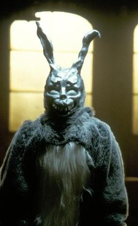
Oh, God. I'm going to be seeing that denture bunny in my nightmares for weeks! Thanks, Allen. Thanks for nothing ... *softly weeps*
But seriously, You've got a strong second design there. I like the "anime motion" background texture. The distressed typeface works extremely well. The bizzare geometry of the thing holds up throughout the composition. The colors work well together. The whole thing has a jagged, dangerous, quality that I quite like. Makes you look like a scary individual indeed.
About the only thing that I can see that might need work, is the spacing between the welcome line and the info block in your main text. Also watch your margin in the middle and bottom text boxes.
Other then that you've got quite a good ... quite a good ...
... quite a ...
... good? ...

I cAn dO AnytHIng I wAnT anD so CaN yOU!!
But seriously, You've got a strong second design there. I like the "anime motion" background texture. The distressed typeface works extremely well. The bizzare geometry of the thing holds up throughout the composition. The colors work well together. The whole thing has a jagged, dangerous, quality that I quite like. Makes you look like a scary individual indeed.
About the only thing that I can see that might need work, is the spacing between the welcome line and the info block in your main text. Also watch your margin in the middle and bottom text boxes.
Other then that you've got quite a good ... quite a good ...
... quite a ...
... good? ...

I cAn dO AnytHIng I wAnT anD so CaN yOU!!
"Inspiration is for amateurs. The rest of us just show up and get to work." — Chuck Close
Michael Ganschow-Green - GRC 175 Instructor
mganschow@tmcc.edu | 673-8200 ext.5-2173
Michael Ganschow-Green - GRC 175 Instructor
mganschow@tmcc.edu | 673-8200 ext.5-2173
-
JonathonJames
- Posts: 52
- Joined: Thu Jan 30, 2014 6:36 pm
Re: Allen Wilburn Project 1 Preliminary
Allen!
I really like the second one with the Drawing of the rabbit-like thing. the layout is good and its easy to read! good job!
I really like the second one with the Drawing of the rabbit-like thing. the layout is good and its easy to read! good job!
-Jonathon J.
-
elizabeth_mejia
- Posts: 92
- Joined: Sun Feb 02, 2014 2:51 am
Re: Allen Wilburn Project 1 Preliminary
I really like the second design the way you used the shapes to put you information in looks great and so do the colors. My only suggestion would be to change the rabbit graphic. I find its grin slightly creepy.
Re: Allen Wilburn Project 1 Preliminary
Cool Staff! I enjoying seeing when people take chances, being themselves, through they creativity and art work in, as that goes I will pick the one with the rabbit. I would consider changing the sizes of the boxes. As of now they all look a little bet crowded to one edge side. I would try to make some of your green boxes longer horizontally and shrink some of them vertically (once that don't contain a lot of information), maybe interact with your rabbit. Play around with the size variations, I think it will add interest to your negative space!
I like your originality, fun designs! Good Job!
I like your originality, fun designs! Good Job!
Amy (oasib)


