
What a process. My page didn't come out as planned. I wanted my page centered but came across a couple problems. I hope to keep working on it after this week of critique!
Project 1-Tina Bodden
-
TinaBodden
- Posts: 47
- Joined: Mon Aug 29, 2011 7:20 pm
Project 1-Tina Bodden
http://grc175.com/student/fall_2011/tin ... index.html
What a process. My page didn't come out as planned. I wanted my page centered but came across a couple problems. I hope to keep working on it after this week of critique!
What a process. My page didn't come out as planned. I wanted my page centered but came across a couple problems. I hope to keep working on it after this week of critique!
~Tina Bodden~
-
LindsWalters
- Posts: 26
- Joined: Mon Aug 29, 2011 7:22 pm
Re: Project 1-Tina Bodden
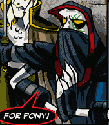
I like the design of your site. You are missing, your sites and needs, along with your goals analysis. But I like the colors you used and how you placed yourself on the chandelier.
Lindsey Walters

Re: Project 1-Tina Bodden
I like your design ideas and the chandelier is adorable. The background is a little loud for my tastes and is kind of distracting and I'm not sure if the links are working as they hoped. It is a great start though!
Ashleigh Porterfield
GRC 175 - Fall 2011
GRC 175 - Fall 2011
-
Melissa_Armstrong

- Posts: 41
- Joined: Mon Aug 29, 2011 6:08 pm
- Location: Spanish Springs, NV
Re: Project 1-Tina Bodden
I love the images, theme, and overall design.
I sent a PM in regards to centering and link issues.
~Missy
I sent a PM in regards to centering and link issues.
~Missy
Melissa Armstrong

Re: Project 1-Tina Bodden
Looks good overall, i agree with someone above that the background is a bit distracting but if you made the pattern like a 20 or 30% black it would be fine. Would have liked to have seen it complete since the buttons do not work but I like the concept and design.
Kyle Smith
-
brienicole

- Posts: 132
- Joined: Mon Aug 29, 2011 5:02 pm
- Location: Sparks, Nevada
Re: Project 1-Tina Bodden
yes you hanging on the chandelier is super cute and fun. I dont know if you noticed but in your container background it looks as if its a light shade of blue and then the chandelier does not have a transparent background so it has a white box around it. Its super discreet but I still picked it up. I agree a less distracting background would be nice.
~Brianne Porterfield
"What a crazy random happenstance!"
"What a crazy random happenstance!"

Re: Project 1-Tina Bodden
Your background is so busy, I guess it forces the eye to look at the one area that isn’t so busy, the content area, so perhaps that is a good idea. I am undecided about that.
I like your content area a lot. I might have lightened up the photo of you a wee bit. And your body copy being centered is interesting. That is different than I would have done it. It is a little hard to read on the purple. What about using the grey that is in your name instead?
But there is nice energy in the photo of you on the chandelier, and the diagonal line of your arms. Really good.
Arlene Williams
Old dragons get tired but they can still flame. Beware!
Old dragons get tired but they can still flame. Beware!

Re: Project 1-Tina Bodden
Awesome site... loud background. I'm not sold on that, but one thing this site is supposed to do is express so if it expresses you then it's a good choice.
The content area is great... I love how the whole page is black and white so the purple in the content area draws the eyes over to it.
I might have used Photoshop to handdraw a purple shirt on your picture to match the purple in the content area, but even though that's my own idea I'm not quite sold on that either. If you get time to try it, it might look really cool.
- Nathan Lundholm
Re: Project 1-Tina Bodden
I actually like the background... I would just center your content on it as that would help break it up a bit. All on one side is a bit much. Also, you'll want to fix your title. Good job!
This post has been brought to you by the letter X, the number 5, and Larry Rubald.
"It's irony at a base level, but I like it." ~Bill Hicks
"It's irony at a base level, but I like it." ~Bill Hicks
Re: Project 1-Tina Bodden
It is a fun design. I think that you could tone down the background a little, maybe a lighter color. At first I thought it might be better if it were centered but I think it works this way. I did notice the change in background color from gray to white for the images and around the border. You may want to take the easy way and just change the background color to white.
Matthew Minten - GRC 175 - Fall 2011