
Project 1 - Kyle Smith

Re: Project 1 - Kyle Smith
As I said earlier, I LOVE YOUR SITE. It looks amazing and I love that you gradiented the background to black. This makes it look great on all size monitors. (Yay ^_^) I love the rollovers as well. I think it would have been cool, as Kristine said, to have them link to random places, but thats not necessary. Looks amazing Kyle, great job!
Ashleigh Porterfield
GRC 175 - Fall 2011
GRC 175 - Fall 2011
-
jfotodesign

- Posts: 32
- Joined: Wed Aug 31, 2011 6:58 am
- Contact:
Re: Project 1 - Kyle Smith
looks great like the color scheme looks almost like an musician singer artist page =D
my Kia beats

Re: Project 1 - Kyle Smith
I think I have already commented on your site. I like it a lot. I like the big yellow headline, and here is an example of where blue on black works well, when it is big enough.
If I have one suggestion... which may not really work in practice, I kind of want to see the smaller My Skills column set off some way or a small vertical dividing line, not the whole length but just a bit, to set it off from the wider left column. It might not look good when you actually do it, but that is my idea.
The luminescent glow from the background is really great.
Arlene Williams
Old dragons get tired but they can still flame. Beware!
Old dragons get tired but they can still flame. Beware!

Re: Project 1 - Kyle Smith
Brilliant. That's a site that asks the user to stay a while... and does a good job of it.
Love the city scene background. Love how your body copy background has just barely enough transparency to show the city scene background behind it. Love it! Love it! Love it! Wish it was mine!
Love the city scene background. Love how your body copy background has just barely enough transparency to show the city scene background behind it. Love it! Love it! Love it! Wish it was mine!
- Nathan Lundholm

Re: Project 1 - Kyle Smith
your site is gorgeous. the end. *runs away crying...
David Bjerre
I found sand!
I found sand!
Re: Project 1 - Kyle Smith
So yeah... I really feel like I have no business critiquing this site.  So... mostly, I won't. Great job! As everybody said, the colors, the layout, it's all fantastic. I love the pic in the background. And I think the only reason some of us are missing links on the rollovers is just because we've been so conditioned to think rollover = link... when it doesn't necessarily have to. I dig it, all the way around.
Possible bug: You project 3 link strays to the end of your content, so that when you are mousing over the little yellow ribbon thing you've got going on there, project 3 lights up and you can click the link. If it was intentional, I don't really see why? And if not, then easy enough fix, if you care to.
Anyway, great job. And also, thanks for all your great comments on the forum too. Much appreciated.
EDIT: oh yeah, I also love the favicon. Took me a minute to realize what I was lookin at, but then it hit me and I was tickled by it.
This post has been brought to you by the letter X, the number 5, and Larry Rubald.
"It's irony at a base level, but I like it." ~Bill Hicks
"It's irony at a base level, but I like it." ~Bill Hicks

Re: Project 1 - Kyle Smith
I agree with all the great comments from everyone else. I really couldn't think of anything that you need to fix or change.
Vy Tat...
Re: Project 1 - Kyle Smith
I don't have anything bad to say about this site. Love it. Has a certain luminescence about it and I keep searching the page to see if there is something else cool. Great job!
Matthew Minten - GRC 175 - Fall 2011
-
Melissa_Armstrong

- Posts: 41
- Joined: Mon Aug 29, 2011 6:08 pm
- Location: Spanish Springs, NV
Re: Project 1 - Kyle Smith
I think the overall design and theme is excellent. You have kept a very similar concept throughout with fonts, links, etc.
I am not sure if you wanted the same grammatical type with each section. With the biography, you have I'm and in the inspiration you have im. It's not a big deal, I was just unsure if you wanted continuity with each section.
With your name, it seems kind of squeezed together. Perhaps it would look better with just a very slight space between first name and last.
The SNAG and Style sheet seem to be very small and hidden in the very far bottom right corner. Perhaps they can be larger and/or placed in a different part of the document.
With the links for inspiration being placed onto the home page (index.html file) instead of in another html page, perhaps it would be better for them to open in a new window by using the target="blank" attribute instead of completely navigating away from your home page so users will not need to navigate back to your site.
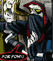
I like the yellow "ribbon" on the top right corner. If it was extended beyond each edge by just a bit, it may look more pronounced and intended. I could not tell that it extended until zooming in a bit.
For the rollover effects with 'welcome'...were you planning at all to add any links or effects? It would be cool perhaps if you did.
Overall, I think it really works. I like the images you chose and I really like the rollover effects with the links. Great job!
I hope to learn much from your site with possible things to incorporate into my site or websites in the future. Again, an excellent job.
BTW...what is the city in the background? I have a couple guesses but not 100% sure.
~Missy
I am not sure if you wanted the same grammatical type with each section. With the biography, you have I'm and in the inspiration you have im. It's not a big deal, I was just unsure if you wanted continuity with each section.
With your name, it seems kind of squeezed together. Perhaps it would look better with just a very slight space between first name and last.
The SNAG and Style sheet seem to be very small and hidden in the very far bottom right corner. Perhaps they can be larger and/or placed in a different part of the document.
With the links for inspiration being placed onto the home page (index.html file) instead of in another html page, perhaps it would be better for them to open in a new window by using the target="blank" attribute instead of completely navigating away from your home page so users will not need to navigate back to your site.
I like the yellow "ribbon" on the top right corner. If it was extended beyond each edge by just a bit, it may look more pronounced and intended. I could not tell that it extended until zooming in a bit.
For the rollover effects with 'welcome'...were you planning at all to add any links or effects? It would be cool perhaps if you did.
Overall, I think it really works. I like the images you chose and I really like the rollover effects with the links. Great job!
I hope to learn much from your site with possible things to incorporate into my site or websites in the future. Again, an excellent job.
BTW...what is the city in the background? I have a couple guesses but not 100% sure.
~Missy
Melissa Armstrong
-
TinaBodden
- Posts: 47
- Joined: Mon Aug 29, 2011 7:20 pm
Re: Project 1 - Kyle Smith
This came out awesome. I really like the way your letters change when you roll over them. Also with the buildings lower down you are able to have a clear area for your content. Great Job.
~Tina Bodden~