Page 2 of 2
Re: Preliminary Critique
Posted: Mon Sep 18, 2017 6:51 pm
by CarnutianDragon
Hi Hannah,
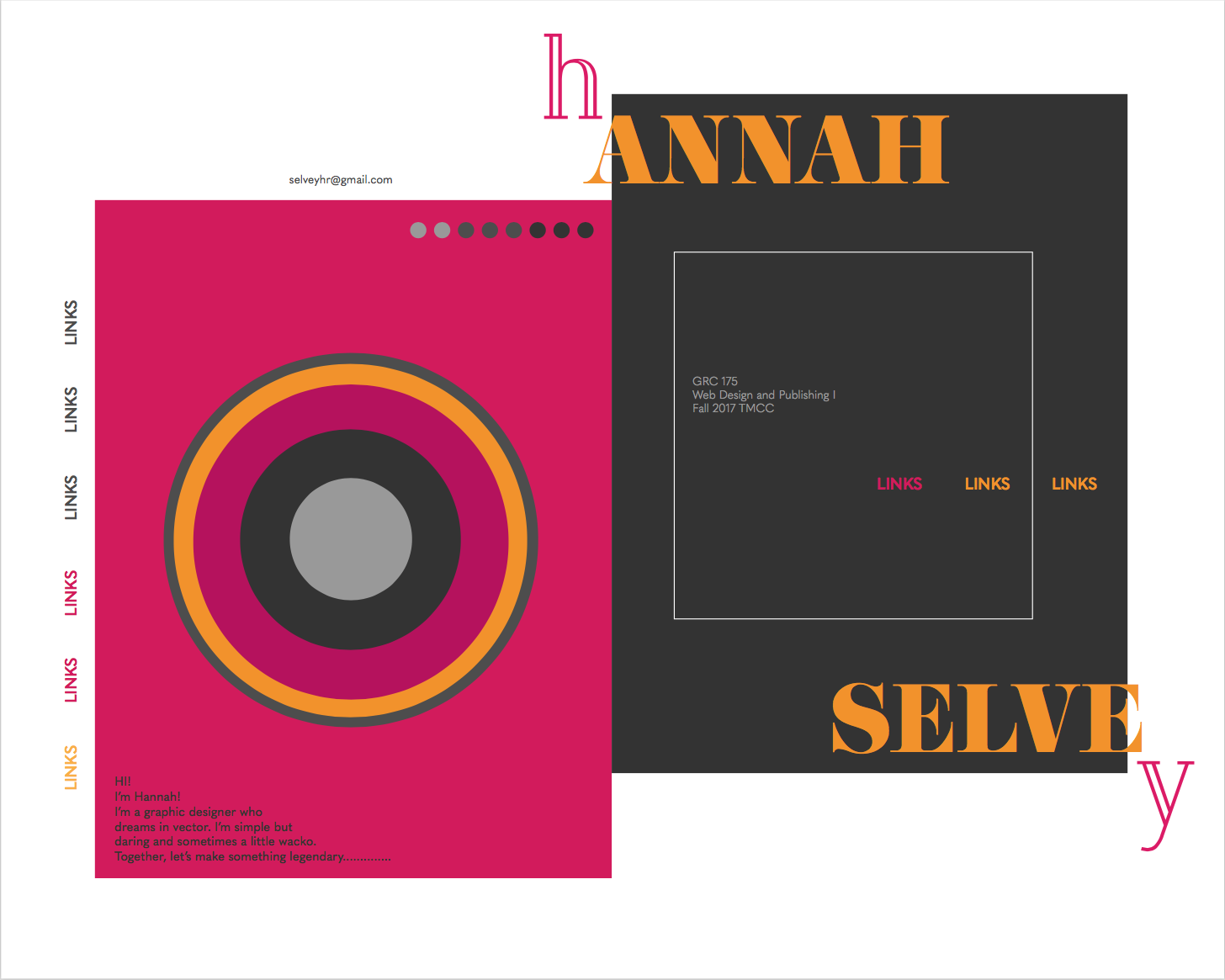
I am really liking your second design but to make it really pop I'd suggest adding design elements from your second into it. The blockiness of your second design combined with the round shapes making up your central character in your first could create a very interesting composition. Definitely increase the size of your type as well since it is difficult to see.
Great job and I can't wait to see your finished product!

Re: Preliminary Critique
Posted: Mon Sep 18, 2017 6:59 pm
by Zera-Chann
Hey Hannah!
I love the second one a bit more love the colors and type, it's really fun!
I would say move were your links buttons to the top it would make the navigation a lot more easier
Can't wait to see your finished work!
Re: Preliminary Critique
Posted: Tue Sep 19, 2017 9:05 pm
by breezy
Hannah, I love them both but that fierce kitty has won my heart! The only thing I would maybe change is to make to text pop a little more, maybe put a drop shadow on it? Good job Hannah!
Re: Preliminary Critique
Posted: Wed Sep 20, 2017 3:20 pm
by SerenDark
These are both very unique and very nice! I do prefer the second design. The colors are outstanding!
So, in the second design, the readability of your name gets lost. The "h" and "y" are so unattached that they don't really easily read as belonging to the rest of the words in question. The rest of the text is also currently really tiny and kinda narrow, which makes it hard to really focus on.
Your first design has readability issues with how most of the text is a similar value as the background, resulting in it not coming across right away or much at all.
Re: Preliminary Critique
Posted: Wed Sep 20, 2017 3:47 pm
by Peelio
Hi Hannah,
The second design is more formal while the other one is playful. I do like them both, but the gray and red one looks tighter. It doesn't feel too much like a magazine.

Some of the text is small, but the colors go together well. I like how you played with asymmetry!
Re: Preliminary Critique
Posted: Wed Sep 20, 2017 4:38 pm
by Cassiebowers
Hi Hannah,
I like both of your designs. They are both stunning and have a very contemporary feel to them. I think I like the second one more though. I love your use of shapes and your type placement, and your use of colors. Maybe make the pink type in the white areas a little bigger so they are easier to see. The leopard is super cool, maybe you will find something cool to do with it later in the semester.
Re: Preliminary Critique
Posted: Wed Sep 20, 2017 4:42 pm
by darian_p
I like the second version better. Its got a nice balance of negative and positive space with a good use of color. Overall its more appealing to look at. Good work!

Re: Preliminary Critique
Posted: Thu Sep 21, 2017 2:45 pm
by JulianEmme
These are both super cool, I might like the second one a little better? it has an old school album cover feel to it that works really well. The h and the y are a little hard to make but but you could easily fix that.
Re: Preliminary Critique
Posted: Mon Sep 25, 2017 4:05 pm
by fjbo
Wow I think this one is fantastic, I really enjoy the classy yet experimental feeling to this one:

I like the illustration on your other draft, which i think it would still fit on your left panel withing the circles. I think you could play with depth with your circles and your feline.
Overall, it is pretty unique from my perspective. It has a very solid color palette which is pretty attractive and fun to the eye. I really enjoy your vertical orientation for your menu, it's gonna make some people tilt their heads. Very effective.
