Re: Project01_Final
Posted: Fri Sep 29, 2023 6:42 pm
You didn't need to make too many changes, Anastasia. This thing was pretty ready to roll when you presented it in prelims.
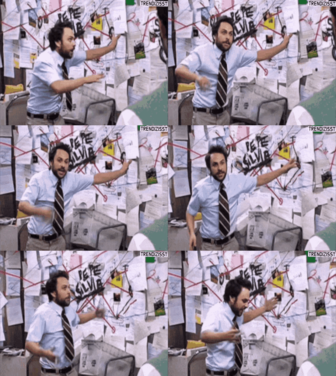
The 1980s Memphis scrapbook is still here. You only minimally messed with it and I am glad. I want to take a red string and draw connections between the photographs to prove some outlandish theory about how traffic signals are going to take over the world or secretly rule it. Maybe along with the mailboxes. The whole thing has a frantic quality to it that I'm really enjoying. It looks like you're visually having a mental breakdown and I'm here for it. The colors are great, as I mentioned in my preliminary critique. It even has decent margins too. And the fonts are fun as well. That blobby headline makes your headlines look like they were carefully cut out of a diner menu or something. Just so much fun all the way around.
It's basically the web version of this:

The only issue I can spot is that your bodycopy is a little close to the edge of your paper on your mobile version. That's it.
Excellent work! Some of the best I've ever seen in this class.
The 1980s Memphis scrapbook is still here. You only minimally messed with it and I am glad. I want to take a red string and draw connections between the photographs to prove some outlandish theory about how traffic signals are going to take over the world or secretly rule it. Maybe along with the mailboxes. The whole thing has a frantic quality to it that I'm really enjoying. It looks like you're visually having a mental breakdown and I'm here for it. The colors are great, as I mentioned in my preliminary critique. It even has decent margins too. And the fonts are fun as well. That blobby headline makes your headlines look like they were carefully cut out of a diner menu or something. Just so much fun all the way around.
It's basically the web version of this:

The only issue I can spot is that your bodycopy is a little close to the edge of your paper on your mobile version. That's it.
Excellent work! Some of the best I've ever seen in this class.