Page 1 of 2
Project 1 Final
Posted: Fri Mar 04, 2022 12:14 pm
by amara_williams
I really wanted to create a simplified approach to my website initially but while looking at other websites, I wanted to build more on how the website would reflect more of me. I decided to keep the lavender and gray scheme of my initial roughs, but I also wanted a fun and modern approach to the design. The change of the layout was a struggle but I was able to find a good balance for my elements.
https://www.orbitmedia.com/blog/web-design-tips/
https://www.format.com/magazine/resourc ... esign-tips
Re: Project 1 Final
Posted: Fri Mar 04, 2022 12:20 pm
by Fatkid53
I like the colors in your design and the depth of your background, it really has the ability to draw in the user. I also like the asymmetrical design with the left justified links. I wonder if a bit of effects on your foreground designs might help the desaturated colors pop off the page a bit and possibly add another layer of depth to your design? NIce work, look forward to see where it goes.
James
Re: Project 1 Final
Posted: Fri Mar 04, 2022 12:58 pm
by piratek
I love the colors and shapes, but especially the shapes. I really like the stagger look on the web version. I really like how everything works together. I am not sure what I would change, perhaps the mobile menu just a hair bigger. Possibly?
Re: Project 1 Final
Posted: Fri Mar 04, 2022 2:57 pm
by lilykmitch
Hi amara
I love the elements you brought into this!! it looks so cool and the purple colors compliment the background super well. I think it looks really professional and really nice! great job!!
Re: Project 1 Final
Posted: Fri Mar 04, 2022 3:12 pm
by squidgola33
I really like the style you chose it looks like an iMessage sort of theme with the way you've surrounded the text into those bubbles. I think that both of your pieces look really professional and eye catching.
Re: Project 1 Final
Posted: Fri Mar 04, 2022 3:42 pm
by Meghna_Misson
Hey Amara,
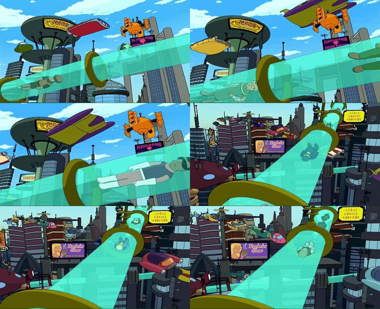
I absolutely love the structure you had created! It looks really cool and reminds me of the transporting tubes from Futurama for some reason haha

.
But other than that, I also do love how playful it is as well and how you emphasized it further throughout the composition with the rounded text for your body paragraph, headlines, and rectangles. My only suggestion would be changing the green color to something more darker to provide a stronger contrast. But overall, this design checks off all the project's requirements well and comes off very visually pleasing towards the user. Greak work!
Re: Project 1 Final
Posted: Fri Mar 04, 2022 7:34 pm
by Instructor
Interesting Amara, it looks like you almost have a kind of messaging interface here. Like a chat or SMS program.
The big feeling I get from this design is frenetic motion. The background seems to be a series of text balloons whizzing by from left to right, their colors overlapping in a kaleidoscope of traffic. Everything on this layout is round or rounded. The only things that are not are your navigational guidelines, which helps draw the eye to your navigation. Even your portrait is inside a little bubble. The whole thing really does look like some sort of chat program. Aside from some issues inn the top shapes, you use margin very well. Everything has room to breathe and, again with the exception of the top shapes/bar, nothing feels crowded or pinched in. Good use of color in your design too. I like that you have foreground and colors and background colors, separated by a dark screen. Your foreground colors have good contrast and do a great job of highlighting what's important. Your type is well chosen too. It's simultaneously rounded and hard edged which goes well with the rest of your design. Your navigation is easy to see and use, too.
I think your pair of shapes at the top could have been widened to give "Amara Williams" and "Graphic Designer" more space between them and and the edge of the shapes on your computer layout. I think your bodycopy would have ready a little better had it been left aligned as well.
Nicely done!
Re: Project 1 Final
Posted: Fri Mar 04, 2022 7:37 pm
by Lucky_Penny
Amara
this design is nice I love the colors and how you designed the Nav tab it is so creative
Re: Project 1 Final
Posted: Fri Mar 04, 2022 7:41 pm
by James Hill
Hey Amara,
I like your designs weirdly enough they give off a hotel webpage design. Your color choice is fun with the contrast of bright purple and muted tan and green. I really like your webpage design. Great job on this project.
Re: Project 1 Final
Posted: Fri Mar 04, 2022 9:13 pm
by zandrews
Hi Amara!
Wow! Really fun and smart use of shapes in your designs! These are super easy to read, follow and your margins and spacing are really well thought out!
My favorite thing is your brilliant use of the two pink lines that come down the page and connect the navigation buttons in a really fun, asymmetrical way with the buttons alternating between each line. Really a cool way to make your navigation pop out and make people want to click/explore your site. Also your use of colors work really well together and the palette as a whole is very pleasing to look at, giving off just a chill, fun design vibe!
My only critiques really just lie with your mobile version as I feel the awesomeness of your desktop navigation was lost in the crossover. Granted that’s the big challenge because it can’t be totally laid out the same due to lack of space compared to the desktop version BUT I would suggest creating a drop down menu and trying to incorporate that same design language of your desktop nav to the mobile version. Also, the nav as it is is more than likely way too small if you were to try to use on a smart phone. That’s the other huge challenge with mobile is while buttons may look like the right size on our computer screens designing these things, when it is put into practice on a small touchscreen, its a totally different ratio of size and function. I struggle a lot with that too so you aren’t alone.
All in all though, very fun designs here and you have a lot to work with in building your site. Looking forward to seeing this progress!

Awesome job!
 .
.