

Hello everyone,
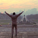
I present you my final version for project 01. I chose to go with the first set of layouts from my preliminary critique since it was by far the most discussed, and I personally enjoy the it turned out in the end. I made my photo bigger on both the web and mobile layouts to go along with my name. I also added the word "graphic designer" below it for an extra touch (I made sure to make it a different weight than my name to keep a sense of hierarchy). Aside from that, I organized the other visual elements in a more uniform and consistent way in order to keep a sense of harmony and uniformity. Finally, I made sure to not leave so much empty space in the mobile layout without sacrificing the concept of white space/negative space. I would like to thank everyone for all of the helpful feedback and suggestions.
Here are the websites that I inspired my design on:
https://angelty.pe/
https://www.universalpatterns.com/
Project 01 Final
Re: Project 01 Final
Hi Juan!
Love your final design! Your name and photo was the first thing my eyes went to, good idea making the photo bigger. Your colors compliment each other so nicely, it feels so retro! Everything is easy to navigate and flows super well, I like how you added some more stars above your name. l I can't wait to see it live!
Love your final design! Your name and photo was the first thing my eyes went to, good idea making the photo bigger. Your colors compliment each other so nicely, it feels so retro! Everything is easy to navigate and flows super well, I like how you added some more stars above your name. l I can't wait to see it live!
~*Jenna*
Re: Project 01 Final
Wow Juan! This really looks great! I love the consistency between the web and mobile versions, especially with the text layout and your main photo/name image. The only thing I might adjust moving forward would be to put the hamburger menu button on the right instead of the left, but at the same time it really works well on the left too. It's so hard to find something to change, seriously, good work.
-Johnna Chism
-
antstronomy
- Posts: 34
- Joined: Thu Jan 26, 2023 4:05 pm
Re: Project 01 Final
Hi Juan!
I really enjoy your design. I think my favorite part has to be the color palette you chose. I think all the colors work together really well. Maybe I'm a bit biased because I feel like our aesthetics may align a bit, but overall a great design! Great job.
I really enjoy your design. I think my favorite part has to be the color palette you chose. I think all the colors work together really well. Maybe I'm a bit biased because I feel like our aesthetics may align a bit, but overall a great design! Great job.
Re: Project 01 Final
Hey Juan!
I love how your layouts came out! I think the changes you made helped you out a ton. I love the color palette, and I think blowing up the image of yourself helps take up a lot of space without being too crowded. If I had to offer any critique, I think you should find a slightly thinner weight for "Graphic designer." I know you changed it already to establish hierarchy, but choosing something thinner would really help establish that hierarchy further. Super sick!
I love how your layouts came out! I think the changes you made helped you out a ton. I love the color palette, and I think blowing up the image of yourself helps take up a lot of space without being too crowded. If I had to offer any critique, I think you should find a slightly thinner weight for "Graphic designer." I know you changed it already to establish hierarchy, but choosing something thinner would really help establish that hierarchy further. Super sick!
Isaac M!
-
kelseymarie_ba
- Posts: 106
- Joined: Tue Jan 24, 2023 7:47 pm
Re: Project 01 Final
Hey Juan,
Super fun and cool layout! Like I've mentioned before, I really enjoyed the accent color of pink to your layout! Something you can play with is text wrapping your bio around your photo. I think a wavy alignment from your arm would be a good compliment for you body text! Hope that helps! Great work!
Kelsey Bautista
-
yasmin_bean
- Posts: 15
- Joined: Tue Jan 24, 2023 7:55 pm
Re: Project 01 Final
Hello Juan!
I love your website and the way everything is positioned. This has great potential to evolve as you learn more about websites and coding, especially your ability to compliment colors. The only thing I'd be worried about is the paragraph font being too thin, but other than that you did amazing.
Yasmin Bean.
-
lil_cactux
- Posts: 84
- Joined: Tue Feb 07, 2023 2:03 pm
Re: Project 01 Final
Hey Juan!
Your website looks awesome, I love the colors you chose and the star decals. great job!
Your website looks awesome, I love the colors you chose and the star decals. great job!
-
Hinata_Sato

- Posts: 105
- Joined: Tue Jan 24, 2023 7:43 pm
Re: Project 01 Final
Hey Juan!
I love the final design! I think it looks amazing and you did a great job on the colors and layout. I love how you added the star on the side and made the links bigger. They're easier to read and I like how you kind of made the logo with your name and "graphic designer". It looks really nice and the pink is working really nicely with the other colors. There's a small change I want to change though, I would move the class information to the bottom with the tmcc logo for the mobile version. Besides that, great work!
I love the final design! I think it looks amazing and you did a great job on the colors and layout. I love how you added the star on the side and made the links bigger. They're easier to read and I like how you kind of made the logo with your name and "graphic designer". It looks really nice and the pink is working really nicely with the other colors. There's a small change I want to change though, I would move the class information to the bottom with the tmcc logo for the mobile version. Besides that, great work!
Hinata Sato
Re: Project 01 Final
Hi Juan,
I love your final designs. The colors you chose work really well and you did a good job with the layout of everything. Also loving that JoJo pose you got going on in your picture! Maybe you could change the alignment on your body type to be forced left to make it look a bit more like a solid square, but it still looks great! Keep up the good work!
I love your final designs. The colors you chose work really well and you did a good job with the layout of everything. Also loving that JoJo pose you got going on in your picture! Maybe you could change the alignment on your body type to be forced left to make it look a bit more like a solid square, but it still looks great! Keep up the good work!