Page 1 of 1
Project One Preliminary Critique
Posted: Thu Aug 31, 2023 9:12 pm
by Austin_Niedfeldt
Hello Everyone!
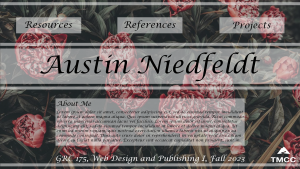
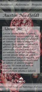
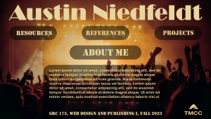
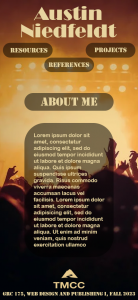
My name is Austin Niedfeldt and I am really excited with how my project has turned out so far. My thinking process before starting this project was thinking of what sort of picture I should use in my layouts as well as if they tie into something that I personally enjoy. I did find the two pictures that I really liked that worked well with the layouts I had in mind. I began with typing in all of the type that was required like my name and the different categories for links that I would need. I am very happy with how they turned out so far. I have used just filler text for my "About Me" paragraphs for now which I will quickly change after this critique.
I was inspired by both of these websites because of how many different layouts i could consider when it comes to making my own designs.
1.
https://designshack.net/articles/inspir ... out-ideas/
2.
https://www.crazyegg.com/blog/homepage-design/

- Design 1: Computer Rough

- Design 1: Mobile Rough

- Design 2: Computer Rough

- Design 2: Mobile Rough
Re: Project One Preliminary Critique
Posted: Tue Sep 05, 2023 5:36 pm
by Instructor
Looking good here, Austin. I like your second one the best. That shining backlight of the stage, pushing through your content is really cool.
The atmosphere on that second one is just fantastic. I can just about hear it if I look at it hard enough. It has such motion and depth. Looks like a poster to me. Something to really be leaned into. The warm colors work well too. They add vibration and energy to the whole thing. I also like how the title just punches right out of the top there. Very in your face, which is entirely appropriate for the composition. The typeface for the title is well chosen, too. Really reinforces that poster vibe. The layout itself is clean and generally easy to navigate. That background pic and title do a lot of the heavy lifting, which is fine on something like this. You don't want to distract form them, because they're so good Your navigation is easy to find and seems easy to use as well.
I'm not 100% sold on the stencil type, at least as it interacts with your title and bodycopy fonts. Maybe use the title font in it's place. I also don't know if you need such tightly defined containers necessarily. I'm wondering if drop shadows or wider dark outer glows might not serve you better for your buttons and page title. And maybe a darkened center area with a soft edge for your bodycopy area. If you are going to go with a firm edge on the container, watch your corner margins on your bodycopy container, especially on your mobile version. Maybe see what it would look like with justified bodycopy, especially on that mobile version.
Good work!
Re: Project One Preliminary Critique
Posted: Wed Sep 06, 2023 1:52 pm
by chloecutter
Hey Austin,
The second design is the strongest layout in my opinion, I enjoy the soft edges of the boxes behind your text, and the font matches the feel of a live concert or show, it reminds me of a vintage/classic movie title. The light yellow text creates nice contrast and the layout seems easy to navigate, great job!
Re: Project One Preliminary Critique
Posted: Thu Sep 07, 2023 5:01 pm
by onnimelon
The second design is definitely better! Better contrast and the background for the image in the first design is just too much/distracting.
Re: Project One Preliminary Critique
Posted: Fri Sep 08, 2023 9:40 am
by ngrover19
Hello Austin!
Really solid layouts, easy to read and methodical placement of text. The typeface on the floral roughs match perfectly with the floral theme. Your second submission is spectacular, as a music enjoyer I feel a sense of excitement in looking at the page. Both submissions translate between mobile and desktop versions nicely, I will take a page out of your book on the layout of my future work. Great job!
Re: Project One Preliminary Critique
Posted: Fri Sep 08, 2023 2:32 pm
by CedarM
Hey Austin,
I really like the imagery you chose for these pages. I think for the flower one the contrast between the flowers and the text is a little low and makes the text hard to read. You could maybe fix this by making the text boxes more opaque or even solid color.
-Cedar
Re: Project One Preliminary Critique
Posted: Fri Sep 08, 2023 6:17 pm
by jillian_rodgers
Hi Austin!
I really enjoy your second theme; I also did a similar one in my design! The concert vibes are strong. The white font looks really nice against that theme too, great job!
Re: Project One Preliminary Critique
Posted: Fri Sep 08, 2023 7:48 pm
by kristenrothbauer
Hi Austin!
I definitely favor your second design. The colors and your navigation really pop and that’s exactly what you want in a design! The typefaces you chose also compliment the theme of the second one really well, great work!
Re: Project One Preliminary Critique
Posted: Fri Sep 08, 2023 9:09 pm
by Giselle
Hi Austin!
I love your second design; the contrast is working, and the pop of color is beautiful! The typeface you chose for the second design also works very well. It is bold but legible! The one thing I would do is maybe change the color of the body type. It gets a little lost towards the end with the picture. Other than that, the design looks ready to go!

Re: Project One Preliminary Critique
Posted: Fri Sep 08, 2023 9:38 pm
by Brooke_Brown
Hey Austin! I really was drawn to your second design, the first one is just a lot of texture and detail in the background which isn't the best to look at and the second design is just so clean