Page 1 of 2
Farmville
Posted: Thu Mar 27, 2014 12:03 am
by c.j.jackson775
Re: Farmville
Posted: Thu Mar 27, 2014 11:16 am
by AWilburn
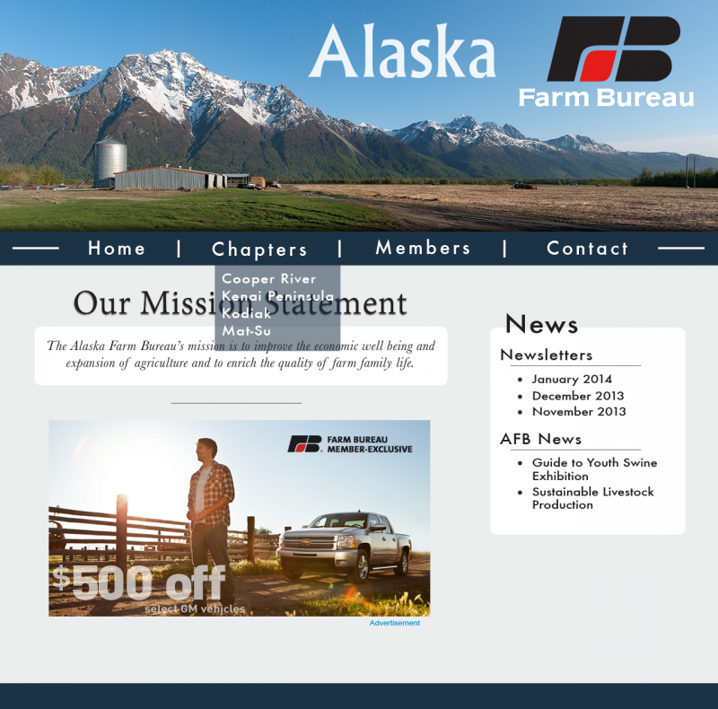
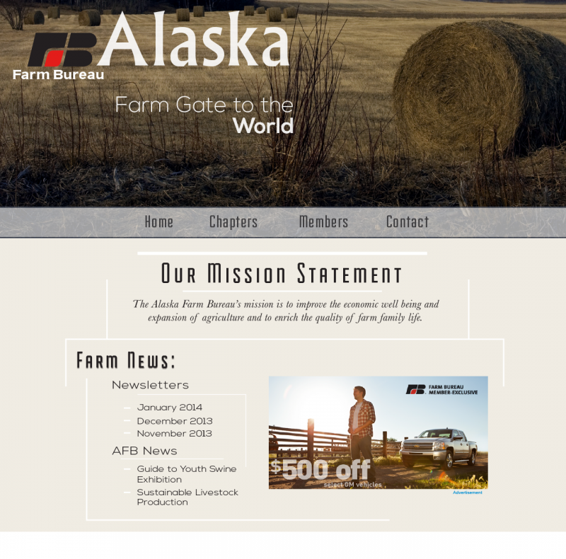
I had to look at these a few times, and I've decided I like the second one more. The first one looks like it could be for a hospital, and the color scheme on the second one is more farm-like. I do like the translucent dropdown menus in the first design.
Re: Farmville
Posted: Sat Mar 29, 2014 3:01 pm
by tabasco_lynn
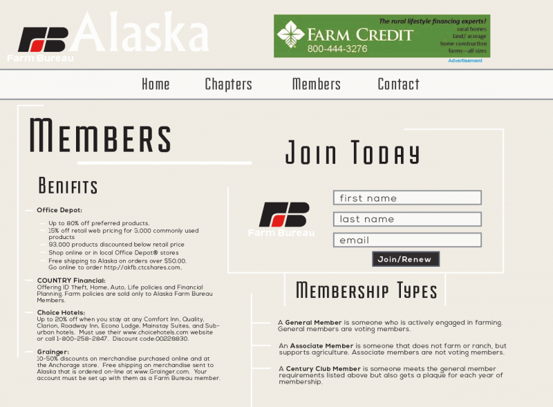
Your second design looks very well put together, but I like the color scheme of the first design. The only thing that bothers me about the first design is the layout of the pictures... Your second design's second page looks more organized.
Re: Farmville
Posted: Wed Apr 02, 2014 10:41 am
by Instructor
From what I can see you have two pretty strong designs here. They're clean, easy to use, and present their information in a legible, easy to digest manner.
Personally I prefer your first design. I like the large image at the top on the home page, and the contrast throughout both the home and inner pages makes your navigation easy to use and your content easy to access. The serif font also ads a touch of warmth that conveys the outdoorsiness and solidity of a place like Alaska.
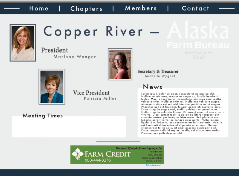
I'd recommend justifying the type on your inner pages on the design to work with the bauhausian grid you have going on in your design. Also play with the proximity of the objects on your inner page design. They're a little scattered right now and don't have a ton of visual hierarchy. After the title my eye doesn't quite know where to go. Maybe try bringing in a top image like your home page, but much more vertically thin so it doesn't dominate your inner page content.
You've got yourself a good start here. Nice work!
Re: Farmville
Posted: Wed Apr 02, 2014 3:33 pm
by danistephens3
Chris-
I like the second design more. I think that the use of the imagery in that one is more "farmville" then the mountain scene you used in the top design. I font you used works well with the design as well. Great job!
Re: Farmville
Posted: Wed Apr 02, 2014 7:17 pm
by charliepecot
Both are well done. Either one gets the job done. I really don't have a feel for either Alaska, farming, or how the two relate, but your site looks serious enough so that if I couldn't find the info I was looking for I would certainly feel like I could contact you and get an answer.
Re: Farmville
Posted: Wed Apr 02, 2014 7:56 pm
by eARTh2haleypw
Hey there Chris! Wow! You're really giving this establishment justice with your roughs. Much UNLIKE the original site...ouch! I think you have 2 great concepts - some gorgeous imagery, suitable font choice, and the index pages are neat and tidy. Well done! Difficult for me to decide, but I'm leaning slightly more towards the 1st rough. The image in the header area is very eye-catching and you've done well in unifying your layout by incorporating its colors throughout.
I feel the inner page can be rearranged a bit better. Maybe remove the logo from the upper right and place it in the upper right? And align the Pres/Vice Pres/ Secretary and Treasurer portraits? Otherwise, nice start!
Re: Farmville
Posted: Wed Apr 02, 2014 9:43 pm
by MattShock23
Both designs look good, nice typography and template layout. I'd have to say the homepage from the first design with the secondary page of the second design. Try scaling things down a bit on the homepage and add some borders to define the content boxes a bit more.
Re: Farmville
Posted: Wed Apr 02, 2014 10:43 pm
by elizabeth_mejia
These are both really great designs I like the first one better the image header is beautiful and the logo fits in well. My only suggestion is for the inner page to this layout the words "Alaska Farm Bureau" is really difficult to see because it kind of blends into the background so maybe make it a little more visible.
Re: Farmville
Posted: Thu Apr 03, 2014 8:17 am
by Deitrik
I don't know this one is pretty hard both designs are very well done.... I think I have to go with design two. I like the whole sign up page it just very well put together in general either one you could have an excellent design with.
