
It's not on my student server space yet. I've got it on my personal space.
It is almost done. But not quite.
http://www.lundholmdesign.us/grc175temp/
Almost done, check it out.
Almost done, check it out.
- Nathan Lundholm

Re: Almost done, check it out.
I think its coming along really well! My one nitpicky thing is the type you used for the body copy is very hard to read, so you might want to swap it for something more legible? Other than that it looks great!
Ashleigh Porterfield
GRC 175 - Fall 2011
GRC 175 - Fall 2011

Re: Almost done, check it out.
I agree, the type for that copy is not quite right.
Arlene Williams
Old dragons get tired but they can still flame. Beware!
Old dragons get tired but they can still flame. Beware!
Re: Almost done, check it out.
I used a lamborghini typeface because the car is a lamborghini, but I get what you're saying. I should use that for other stuff but the body copy should be something easier to read.
- Nathan Lundholm
Re: Almost done, check it out.
The rest of it is great. I love the car.
Arlene Williams
Old dragons get tired but they can still flame. Beware!
Old dragons get tired but they can still flame. Beware!
-
brienicole

- Posts: 132
- Joined: Mon Aug 29, 2011 5:02 pm
- Location: Sparks, Nevada
Re: Almost done, check it out.
ya I agree the type is a bit squished. If its Italisized maybe make it regular, that my help. Or play with another one. Other than that its coming along. The cut off on the photo is a bit distracting. Maybe a frame or gradient mask to help that out.
~Brianne Porterfield
"What a crazy random happenstance!"
"What a crazy random happenstance!"
Re: Almost done, check it out.
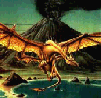
Looks good. Couple things I noticed. Are the dots on the upper right of the page on purpose? because they look like a mistake. Another thing your project 2 and 3 rollovers do not work but Im sure its just because you haven't done them yet. Other than that a slight problem is the picture you took of yourself is not cut out very well. You can see that you were on a white or light colored background. Not sure how well your Photoshop skills are or if you even care that much to fix it, because its a pain in the ass so I don't blame you if you dont feel like fixing it. Last thing the car on the bottom is cut off before you see the bottom of the tires, might be because of the picture you used or whatever but just a small thing.
Kyle Smith
Re: Almost done, check it out.
The dots on the upper right are not on purpose but Photoshop didn't save my image with the slices intact like it was supposed to and if I reselect the slices they won't be separated in exactly the same place. If I fix the dots on the upper right now it would throw off the whole design so I'm just going to say it was an intentional design choice. But between you and me what actually happened was I forgot that that gradient to the right was part of the banner slice so I saved the banner slice as a two color gif. Oops. Lesson learned in the future, be more careful about slicing and saving.
I am not going to set up the project 2 and 3 links as rollovers until they are actual links. That way people are less likely to get confused and think they're supposed to go somewhere. LOL
As for the picture, I figured it's good enough.. I don't know why there's a white line around it but it was actually on a dark background before. I can show you the original picture if you want.
As for the car photo clipping off the bottom of the tires, that was because of the picture I used. Personally if I was taking my own pictures for a site I would have chosen to catch all the tires so they don't look flat or popped, but oh well.
- Nathan Lundholm
Re: Almost done, check it out.
By the way I changed the body copy by deleting it entirely from the picture formed by the body copy slice and adding body copy text in Dreamweaver.
http://www.lundholmdesign.us/grc175temp/ if you want to check it out again.
http://www.lundholmdesign.us/grc175temp/ if you want to check it out again.
- Nathan Lundholm
-
brienicole
- Posts: 132
- Joined: Mon Aug 29, 2011 5:02 pm
- Location: Sparks, Nevada
Re: Almost done, check it out.
Nathan that body copy is 100% better! and fyi you can go back into your psd and resave that slice as a png24 with the same name and it will ovrwrite the old one. Its actually pretty easy. If you have skype ( for screen sharing) Im on there as brianne porterfield if you want to add me and Im more than willing to help.
~Brianne Porterfield
"What a crazy random happenstance!"
"What a crazy random happenstance!"