I really couldnt pick just two.. so these are the ones Im going to show here..hopefully you all can help me narrow it down to two. (some of them have a down state)
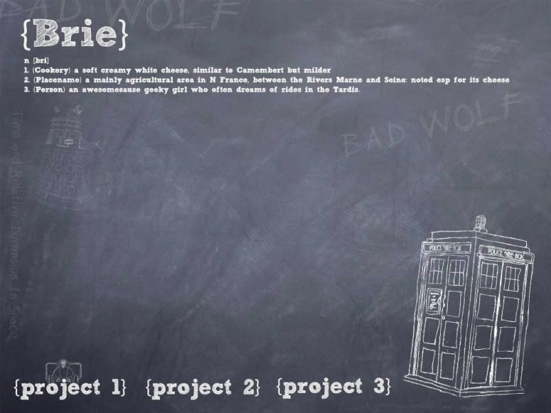
My favorite is this one. The Cyberman head is the down state (or rollover)
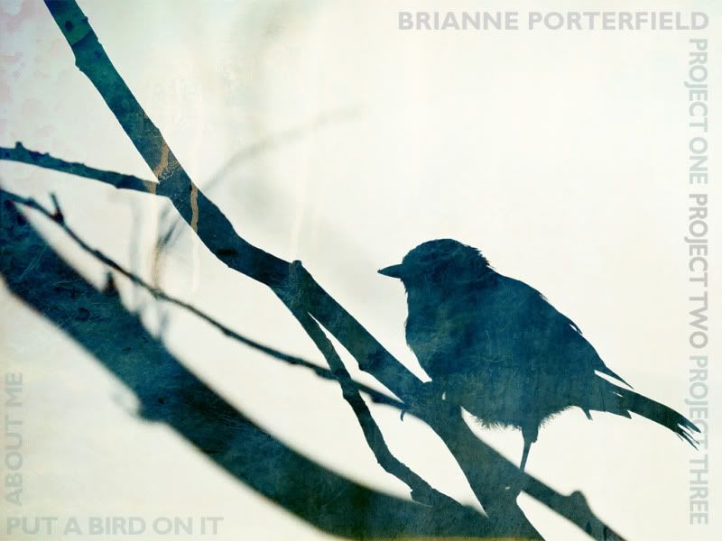
This is my artsy one.. Im not sure I love it
My simple bird...if you get you are cool!
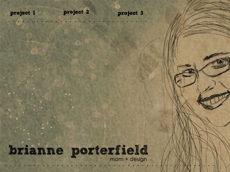
My vintagey inspired one ( again the white is the rollover state)
Last edited by brienicole on Sun Sep 18, 2011 12:36 pm, edited 1 time in total.
~Brianne Porterfield "What a crazy random happenstance!"
I like number two the best, but also one and three. Not much help am I? I like number two because people always respond to the personal... the sketch of you. It gives a warmth and looks like someone I would want to find out more about so I might investigate the site.
Arlene Williams
Old dragons get tired but they can still flame. Beware!
Welp. You've encountered a problem that crops up from time to time in design. You have several equally good alternatives! My opinion, in order of appearance.
Design 1: Aww, it's a Doctor Who blackboard. A cheeky little concept that, from my point of view, expresses a fun sense of humor (love the definition) and a *ahem* strong dedication to Doctor Who. The concept is well executed. Navigation is easy to follow and it has a large content area that allows for future expandability. Too much fun. Definitely a contender.
Design 2: Another contender. This one's more of a standard introduction page. I keep wanting to wave at your portrait! I especially like the "prepped canvas" texture in the background. The navigation is not quite as easily picked up as the first one. Though I really like the use of the dotted lines as a framing device. Very strong design.
Design 3: This one I would say you can discard. As with the first two, it's fantastically executed. Love the texture and focus on the bird. A very strong composition. However, as a web page it doesn't work so well. The navigation is kind of a background whisper (*shhhh*Project One Project Two Project Three*shhhh*) and the bird is sitting in the middle of your content area. Also, you've put a bird on it, but is it really art?
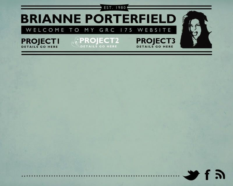
Design 4: I really like the "retro newspaper classifieds" look you have going here. This design is much simpler and cleaner than your other ones. It uses typography layout elements to make it's statement. Very strong. Navigation's easy to gasp and works well. The wacky portrait adds a bit of fun to the design as well. The only thing I don't care for is the dotted line at the bottom. I think it clashes with the rest of your design. Use a solid bar instead. Otherwise a neat composition.
Overall, excellent execution across the set. A very strong group of designs. Keep the ones you don't use an reuse 'em later on in your design career. If it was my call, I'd say discard designs 2 and 3 and and tinker on designs 1 and 4, but ultimately you have to take a look at these and ask yourself "which of these designs best represents me?" .
"Inspiration is for amateurs. The rest of us just show up and get to work." — Chuck Close
Michael Ganschow-Green - GRC 175 Instructor mganschow@tmcc.edu | 673-8200 ext.5-2173
Wow, thanks for the feedback. I think Im going to go with 1 and 4 ..I have my face in 4 so that solves the issue of (personalness(sp?) that Olddragon was mentioning. I do feel like Ill end up with my Tardis one, but Id like to tinker with the fourth.. I dont know what its missing but I feel it needs something else!
~Brianne Porterfield "What a crazy random happenstance!"
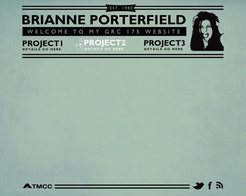
brienicole wrote:Do we need the TMCC logo in each design? Here is a re do
Try using one long, thin line long the bottom. Also you may want to thin up the lines on your top banner. Maybe try a single line on the bottom of the banner.
"Inspiration is for amateurs. The rest of us just show up and get to work." — Chuck Close
Michael Ganschow-Green - GRC 175 Instructor mganschow@tmcc.edu | 673-8200 ext.5-2173
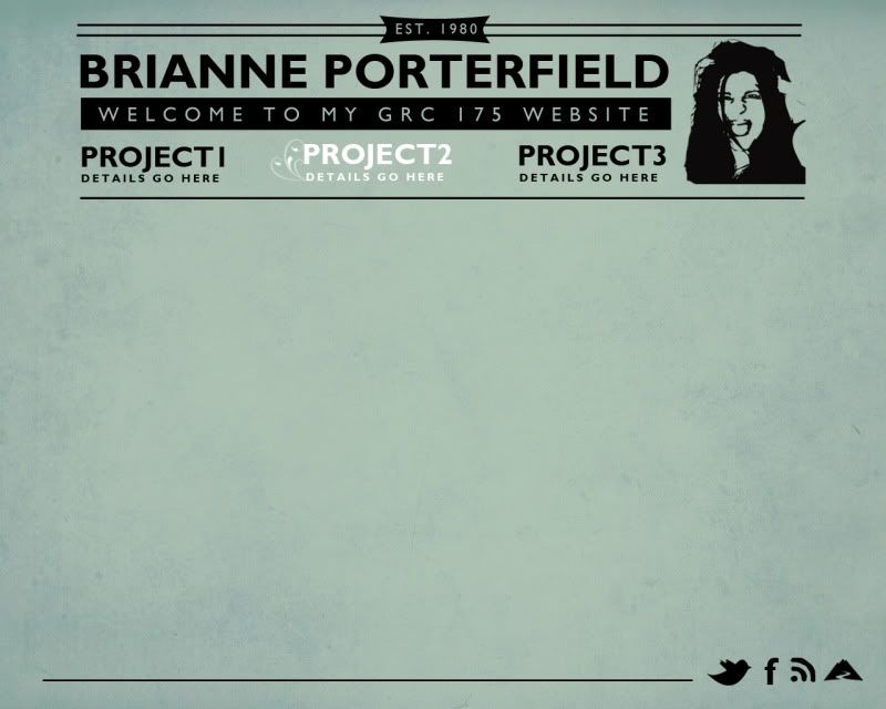
Okay tired those..not sure how I feel yet.. I do like the thinner line but not how its measuring..Although, Ill probably end up with the Tardis one as its still my favorite!
~Brianne Porterfield "What a crazy random happenstance!"
Yeah, I'm liking what I see there. I'd say narrow up that bottom bar so it makes a framed area using whitespace, but otherwise coming along very nicely.
"Inspiration is for amateurs. The rest of us just show up and get to work." — Chuck Close
Michael Ganschow-Green - GRC 175 Instructor mganschow@tmcc.edu | 673-8200 ext.5-2173