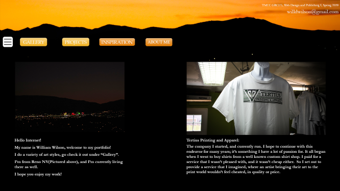
This is the site mockup I made for this site. A lot changed, surprise surprise.
Back to Homepage
This site has a yellow/orange theme with a dark background. I tried to use only my own amateur photography for the site, and I wanted to showcase my growing skills in Photoshop, Illustrator, traditional art, Premiere, coding in HTML5, CSS, and Javascript, etc. If you like it, check out these other sites I worked on.
Internet Archaeology
This is the original Internet Archaeology homepage.
I decided to go with a simple monochromatic theme with rounded buttons, backgrounds, and links for this project. The site needed more clear direction, and a safer feeling to it. So I went with a blue color and grey internals. The gif needed to stay, so I kept it as a banner for the nav. I hope you enjoy!
TMCC Graphic Arts
This is the original TMCC Graphic Arts homepage.
I kept the colors of TMCC, from the logo used in the header. I made it more mobile friendly, and less text heavy. I hope you like it!
